UX/UI

Emails analysis

UX Design

My Role

1 month

Duration

INDIVIDUAL PROJECT

About project

ANote Music is a platform that enables users to invest in music catalogues and earn monthly royalties. A usability test revealed that users were not fully engaging with the product, primarily due to a lack of understanding at multiple touchpoints, including the website, platform, and unclear email communication.

These findings led to a redesign of the website and platform. However, to optimize the overall user experience and comprehension, I considered it essential to conduct an in-depth analysis and redesign of the email communication that supports users throughout their journey.

My focus was to evaluate the existing materials from a UX perspective and provide actionable insights to the marketing and design team. The goal was to help them restructure content and improve messaging to enhance user understanding, engagement, and investment confidence.

The problem

User research and email data revealed five core issues limiting conversion and engagement:

  • Low open and click-through rates
  • Low account completion rate (necessary to invest)
  • Lack of understanding of how music investing works
  • Vague or confusing messaging, failing to build trust and correct understanding
  • Visual inconsistency, lacking the polish of a fintech product

The Goals

To improve both the user journey and business outcomes, I defined the following objectives:

  • Help users to undesrtand ANote Music product
  • Clearly communicate the value and potential of music as an investment class
  • Ensure messaging aligns with the right moment in the user journey
  • Increase user trust, confidence, and transparency
  • Eliminate ambiguity with clear, concise, and accessible content
  • Apply a modern visual and content tone, in line with fintech best practices
  • Minimize cognitive load by improving content hierarchy and scannability

The results

The improvements led to tangible performance gains:

Design Process

Guided by the 5 Planes of UX

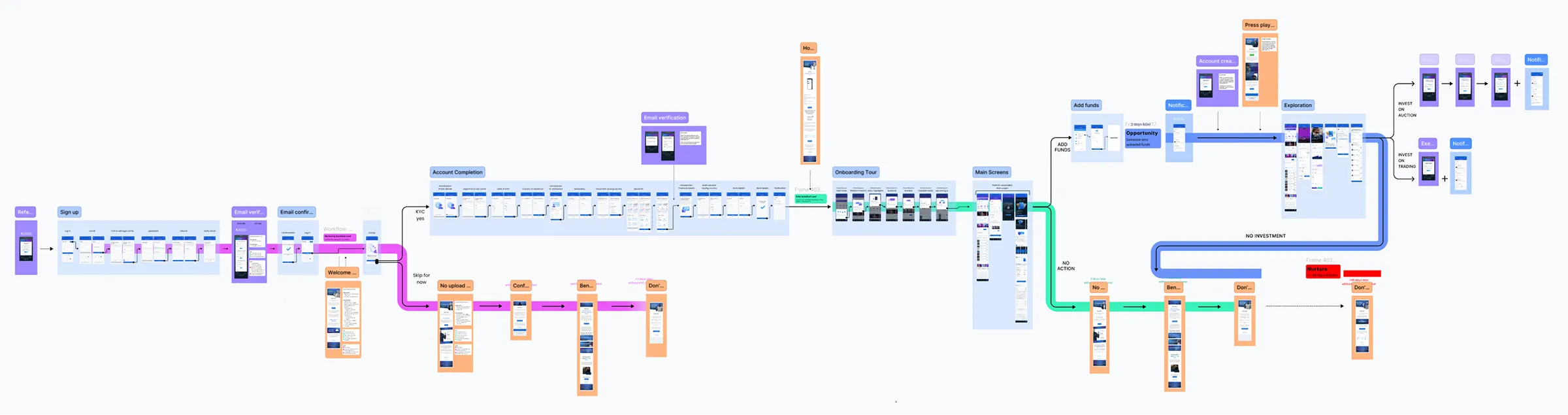
I began with a deep analysis of the current email flow to identify friction points and content gaps. It became evident that aligning user expectations and understanding during their journey inside the platform was critical as the existing email workflow was no longer aligned with the user journey.

My role

While this was a cross-functional initiative, my primary responsibility was focused on UX analysis of the platform’s AWS emails and marketing workflow emails. My contributions included:

  • Auditing onboarding and promotional emails using journey mapping
  • Applying UX writing principles, cognitive psychology, and neuroscience insights to assess clarity, tone, and comprehension
  • Identifying communication gaps between product expectations and real user understanding
  • Provide a visual direction, offering feedback from both a UX and design perspective

Team & Collaboration

For the project achievement, a close collaboration across departments was involved:

  • Irene – Marketing Specialist, responsible for email strategy and copywriting
  • Geoffrey – Community Manager & Graphic Designer, responsible for final high-fidelity visuals

1. Strategy Plane

Defining objectives and understanding current situation

Strategic Objectives

The user needs and business objectives were clear enough from the beginning of the project.

User Needs

  • Clear understanding of the product
  • Helpful, transparent information
  • Support to make investment choices
  • Confidence in the brand

Business Needs

  • Increased engagement
  • Higher account completion
  • More users participating in auctions
  • Improved conversion and trust

Evaluation of initial situation

I considered it essential to evaluate the initial situation in order to understand the issues & problems and not repeat them.

Engagement & 3-Second Rule

  • Email subjects were passive, with poor visibility and contrast
  • Hero images were non-informative and wasted valuable space
  • Key info wasn’t visible within the first fold

Readability & Mobile

  • Paragraphs were too long and vague
  • Overuse of highlighted words made it hard to focus
  • Font sizes were too small on mobile, hurting accessibility

CTA issues

  • Some calls-to-action were buried at the bottom
  • Button text was too long or unclear

Communication Gaps

  • Emails focused too early on “pushing” users to invest
  • Messaging lacked supportive, educational content to build trust
  • Slang, metaphors, or overly abstract phrases confused readers and created misunderstanding and unrealistic expectations
  • Lack of clarity on how ANote Music worked to build understanding and trust

Dark Mode Issues

  • Logos and buttons became invisible
  • Poor color contrast across modes (e.g. white on light blue, black on blue)

2. Scope Plane

Redefining Email Content and Features

Email Infrastructure

Emails were sent via two platforms:

  • AWS: Transactional (e.g. password resets, order confirmations etc)
  • Hubspot: Automated and marketing workflows (e.g. onboarding, promotions)

The tools stayed the same, but content and structure of key user-facing emails were redefined, especially those that guided users after sign-up.

Dark Mode Compatibility

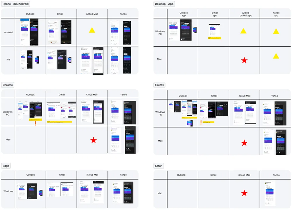
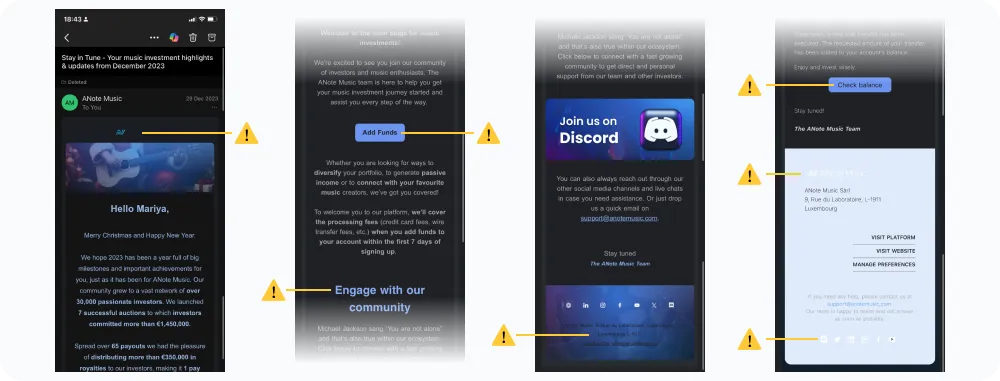
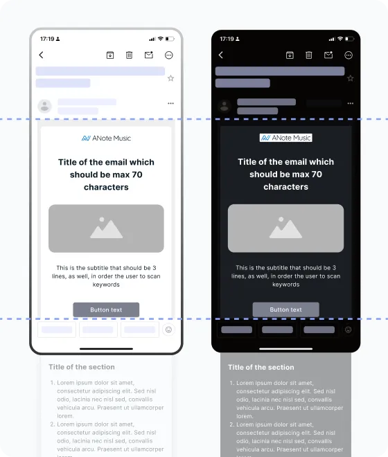
Emails were tested across devices to ensure readability and consistency in both light and dark mode. At this stage we defined:

  • The logo should be an PNG with white background
  • The icons should be transparent png
  • Colors of fonts and elements that looks good on light and dark mode

Content Strategy

To reduce cognitive load and increase clarity, I introduced the following standards:

  • Action-driven titles
  • Short paragraphs to avoid overwhelming users
  • CTA with clear action
  • Real user testimonials for assurance
  • Charts and graphs for credibility
  • Simple, lifestyle imagery aligned with the platform’s to build emotional resonance and trust
  • Bullet points or numbered list for faster and clear scannability

3. Structure Plane

Mapping the Email Journey

The user journey

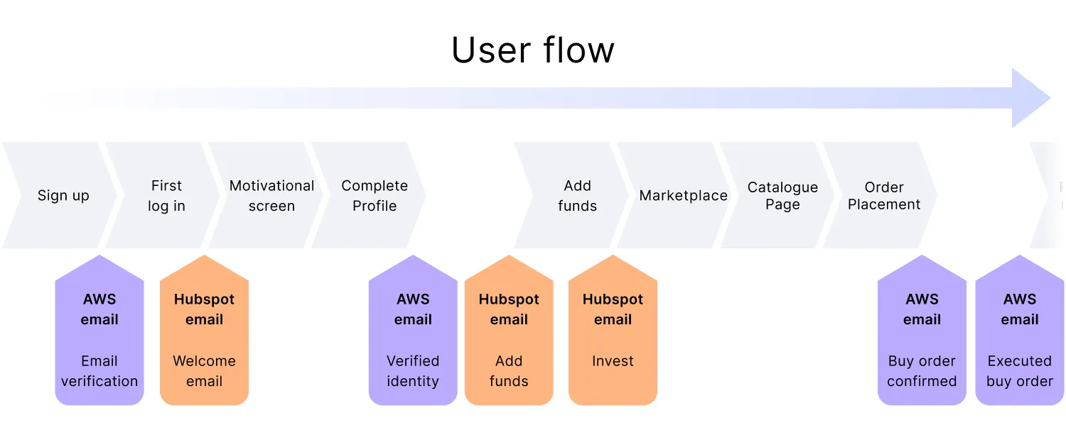
To ensure emails were sent at the right time with the right message, I visualized the user journey inside platform alongside:

  • User flow per stage (signup, profile completion, first investment, etc.)
  • Emails sent as per user flow and actions
  • Color-coded templates:
  • AWS (transactional)
  • Hubspot (marketing workflows)

Communication & Persuasion

In a previous UX project, I identified the key information users need to receive prior to creating an account in order to improve their understanding, build trust in ANote Music, and encourage investment in music.

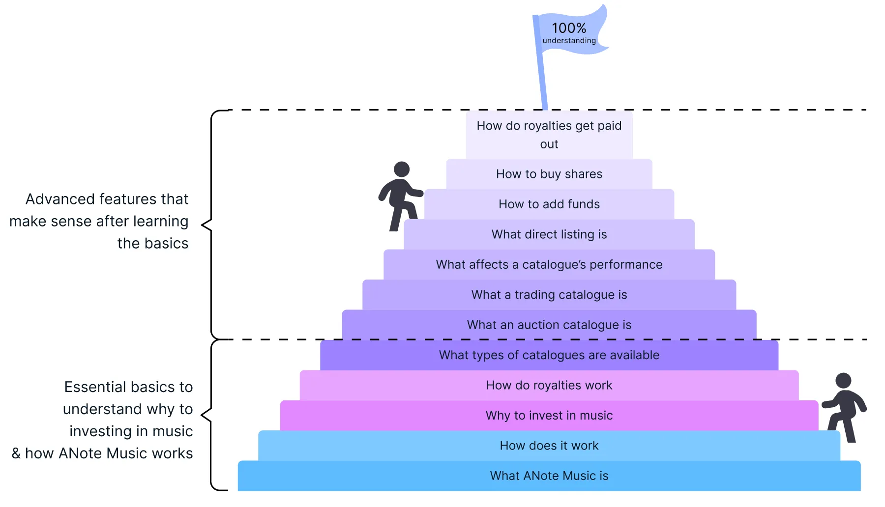
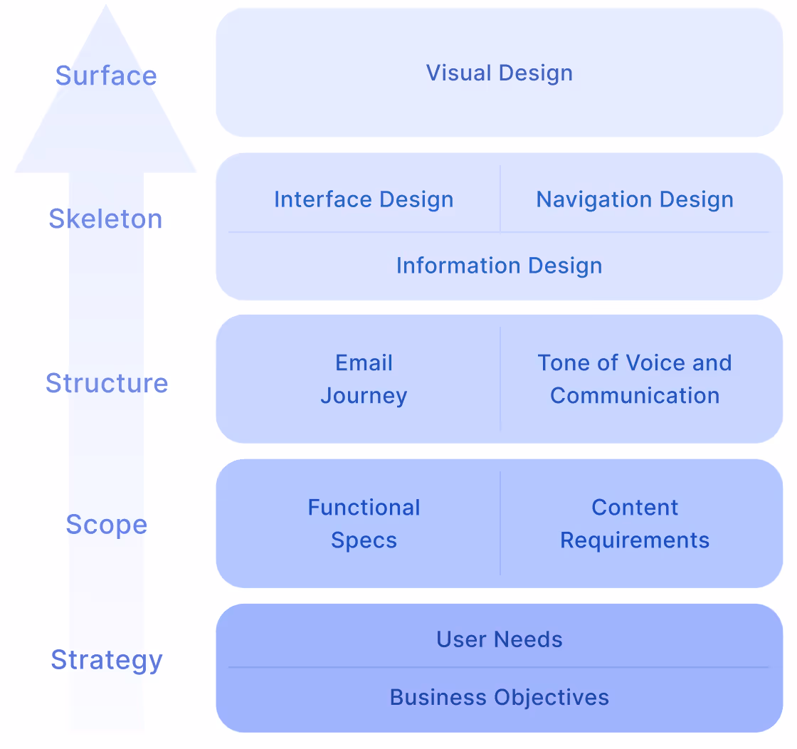
The combination of the user journey and the main information pillars allowed to:

  • Define the purpose and content of each onboarding email from a UX perspective
  • Align the communication flow and information architecture with what users have already received, understood and experienced in-platform
  • “What information the users have received up to this moment?”
  • “What they need at this stage and how this could be communicated?"
  • “What will incentive them to take an action at this specific stage?”
  • Ensure terminology consistency across platform and emails
  • Identify redundant messages

Tone of Voice

To define the tone of voice it really helped the main defined personas. The tone should make users feel included, excited, and respected:

  • Clear & Confident: For financial trust and credibility
  • Warm & Approachable: To humanize the platform and make users feel welcome
  • Passionate: Reflects the energy of the music world
  • Inspiring: Motivates users to engage and invest
  • Simple & Direct: For faster scanability and accurate understanding, that builds clarity

Tones avoided: technical finance terminology, trendy slang, metaphors or pushy sales language.

4. Skeleton Plane

Wireframing the Layout

Wireframe template

To support content and visual production, I delivered email wireframe template with:

  • Clear hierarchy: heading, subhead, body
  • Short title (max 3 lines)
  • Optimized font sizes for mobile and desktop
  • Strategic CTA placement and size - visible before the fold
  • Layout versions for light and dark modes
  • Guidelines for image placement and structure
  • Clear margin and paddings for desktop and mobile

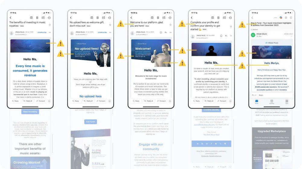
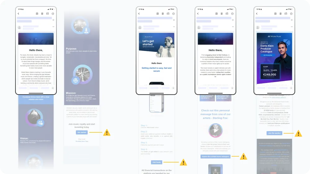
Insights from previous testing showed that users often missed CTAs or were unsure about what action to take. In response, buttons were redesigned with clearer affordances and strategic placement throughout each page.

How to approach a redesign

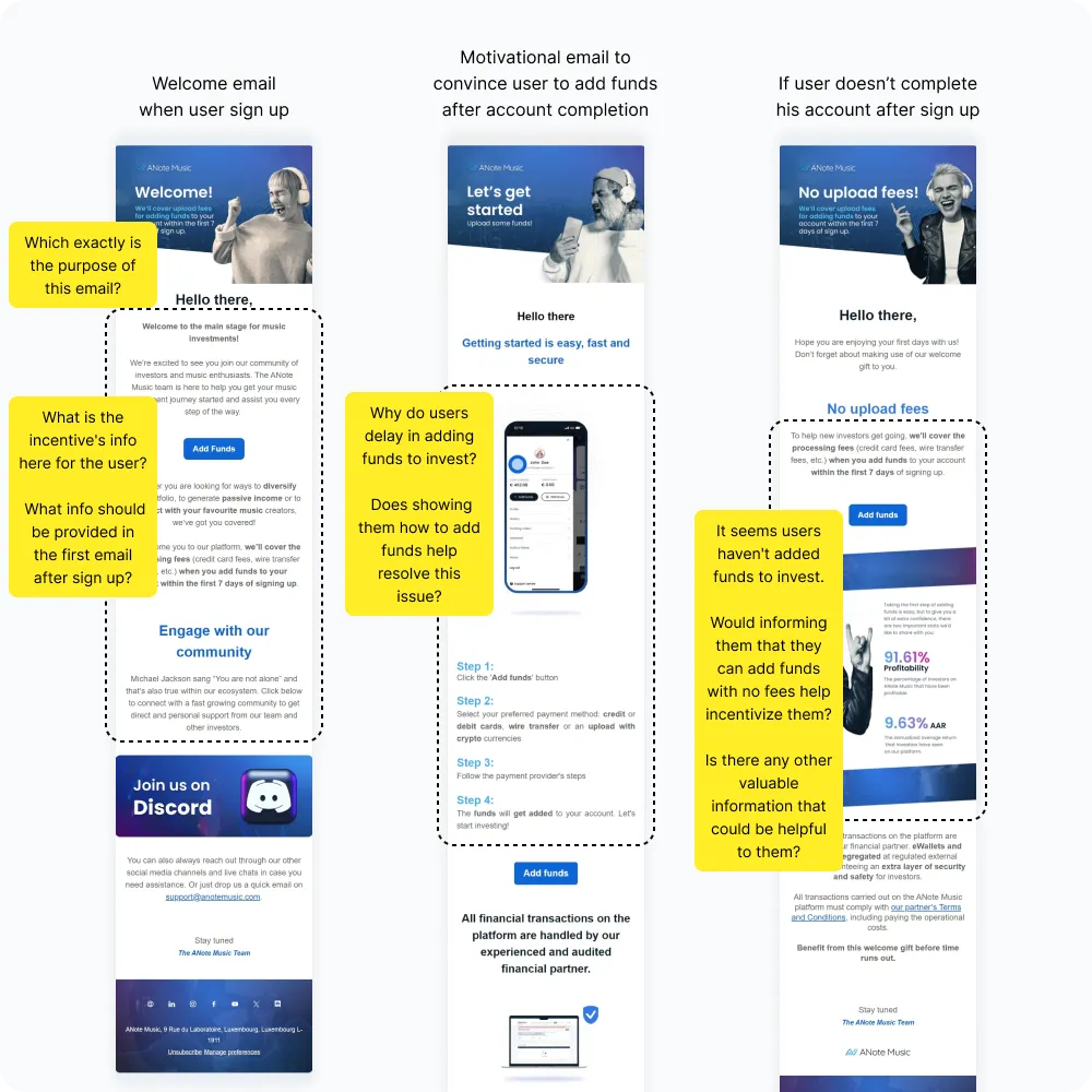
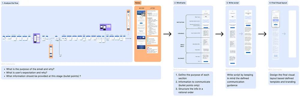
To provide an example on how to approach each email review, I analyzed the welcome email by following a structured UX process by combining all the above principles and guidelines. This example helped the marketing team to understand how to break the problem into smaller components, allowing them to focus on the purpose of each email and it’s information structure before focusing on visual design.

5. Surface Plane

Final Visual Design

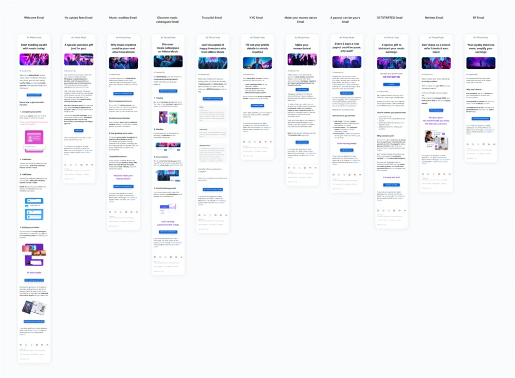
Based on my UX guidelines and wireframes, Irene (Marketing) and Geoffrey (Design) implemented the final email series:

  • Emails were rewritten to be supportive, clear, and concise
  • Visual assets reflected a modern fintech tone while maintaining ANote’s music brand identity
  • The final series was tested, iterated, and rolled out over the next quarter

The results

The improvements led to tangible performance gains:

Key Takeaway

This project reinforced how email communication is not just marketing - it’s UX. By approaching the email flow as part of the broader product experience, we closed key gaps in the user journey, aimed to build trust, and boosted investment activity. As a UX designer, this project allowed me to bridge strategy, psychology, writing, and visual direction - collaborating across teams to create a consistent and conversion-focused experience from website to inbox.