
ANote Music is a music investment platform that enables users to purchase shares in music catalogues and earn monthly royalties from the songs’ performance within the music catalogues.
Internal analytics revealed a high drop-off during the sign-up and KYC (Know Your Customer) process. This onboarding friction led not only to low conversions but also to operational overhead and increased customer support tickets.
I led the UX strategy and execution for redesigning this critical conversion funnel, working cross-functionally with product, legal, and customer support teams.
People involved: Ginna Lozano (Customer Success Officer), Matteo Cernuschi (COO), Virginia La Torre (Product Manager), Joris Hotton (UI/API Developer), Henri Sycip (UI/API Developer), Luigi Felaco (Full-stack Developer & Operations Analyst).
Key user problems:
Key business problems:
User Goals:
Business Goals:
Key outcomes 2 months post-launch:
To guide the process, I followed the Double Diamond methodology, which allowed for both broad exploration and focused refinement:
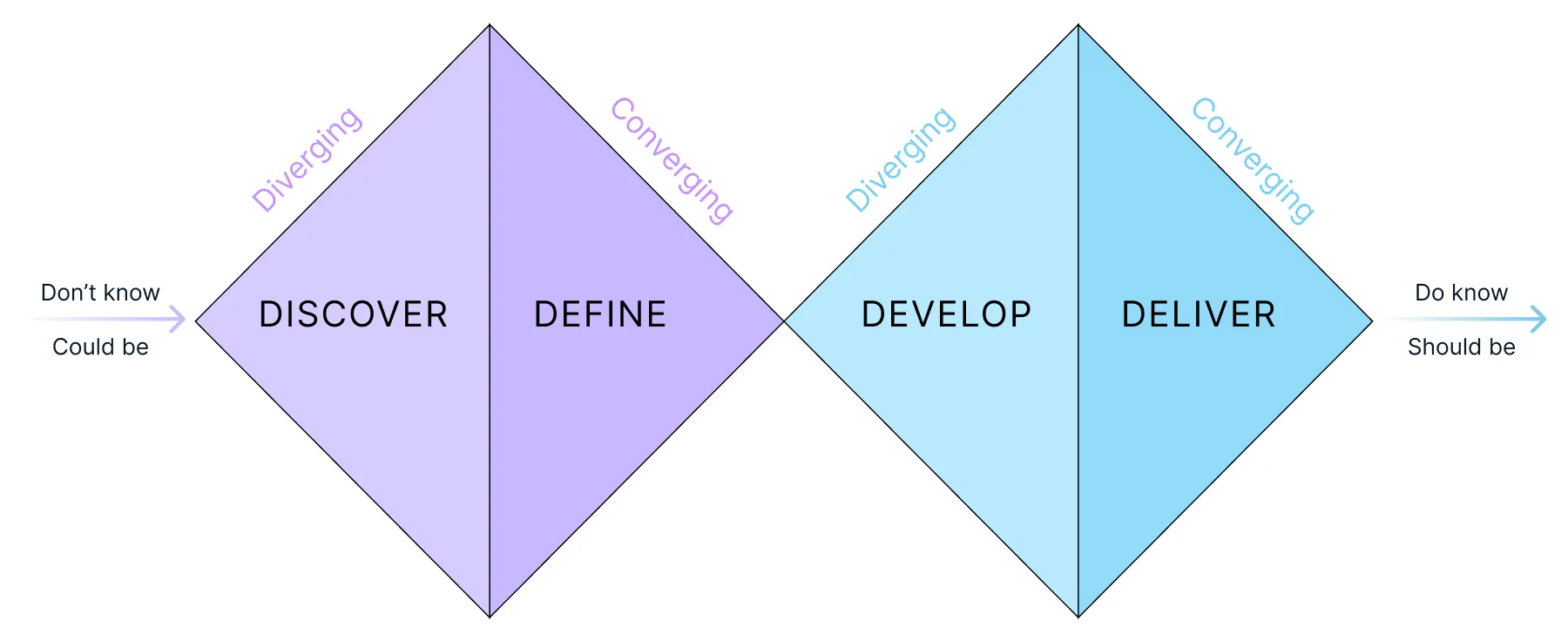
Using the Double Diamond framework, I started by gathering insights from user behavior analytics, customer support tickets, legal & compliance constraints, technical feasibility (AWS Cognito, Mangopay) and direct feedback from users.
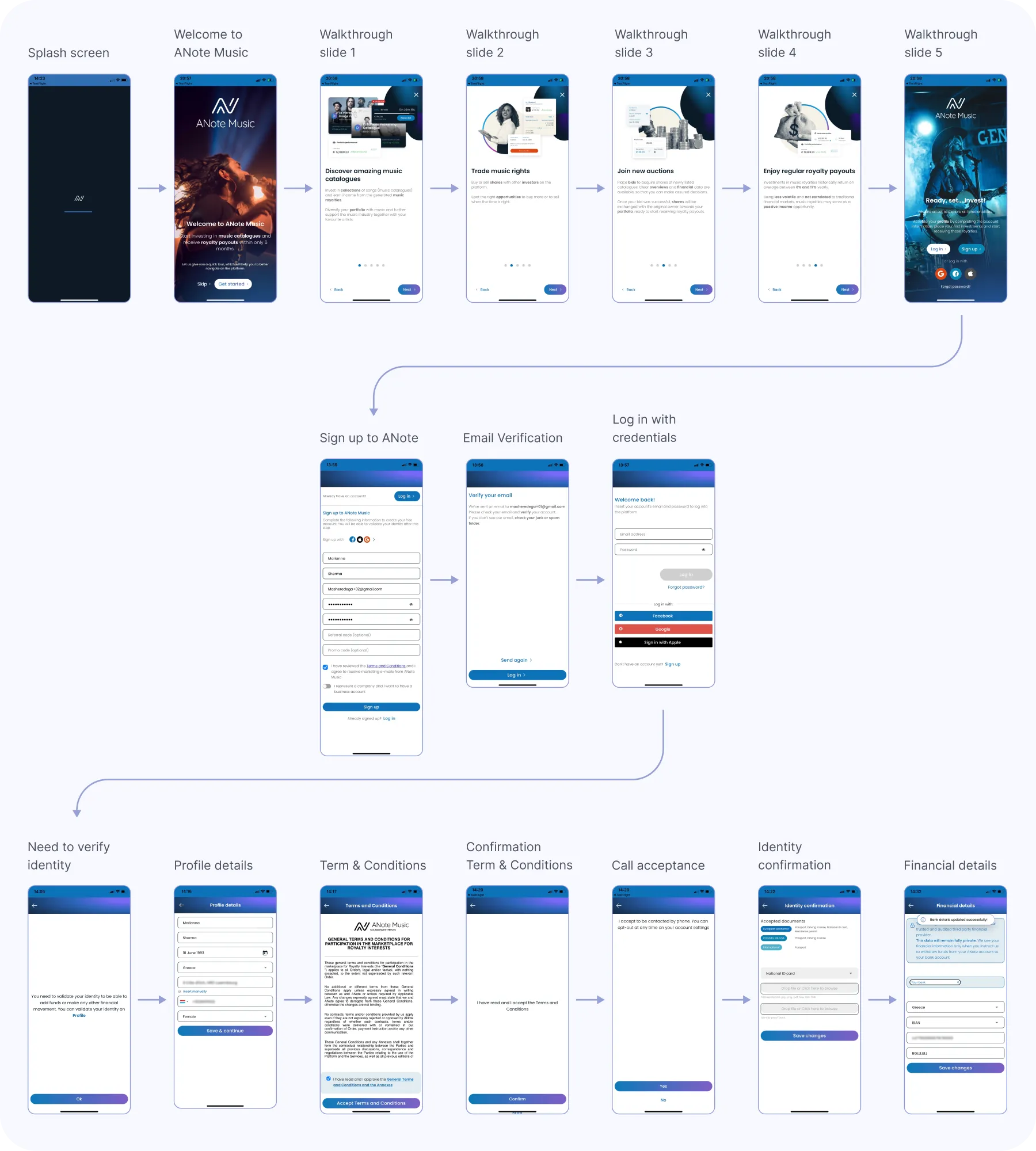
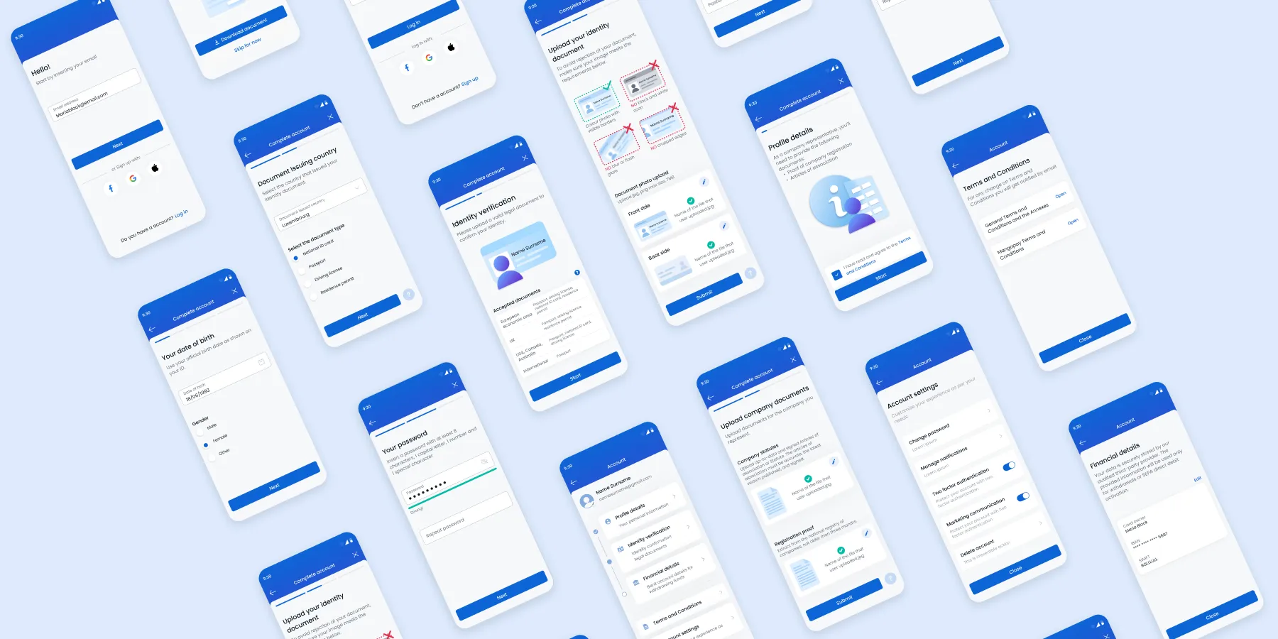
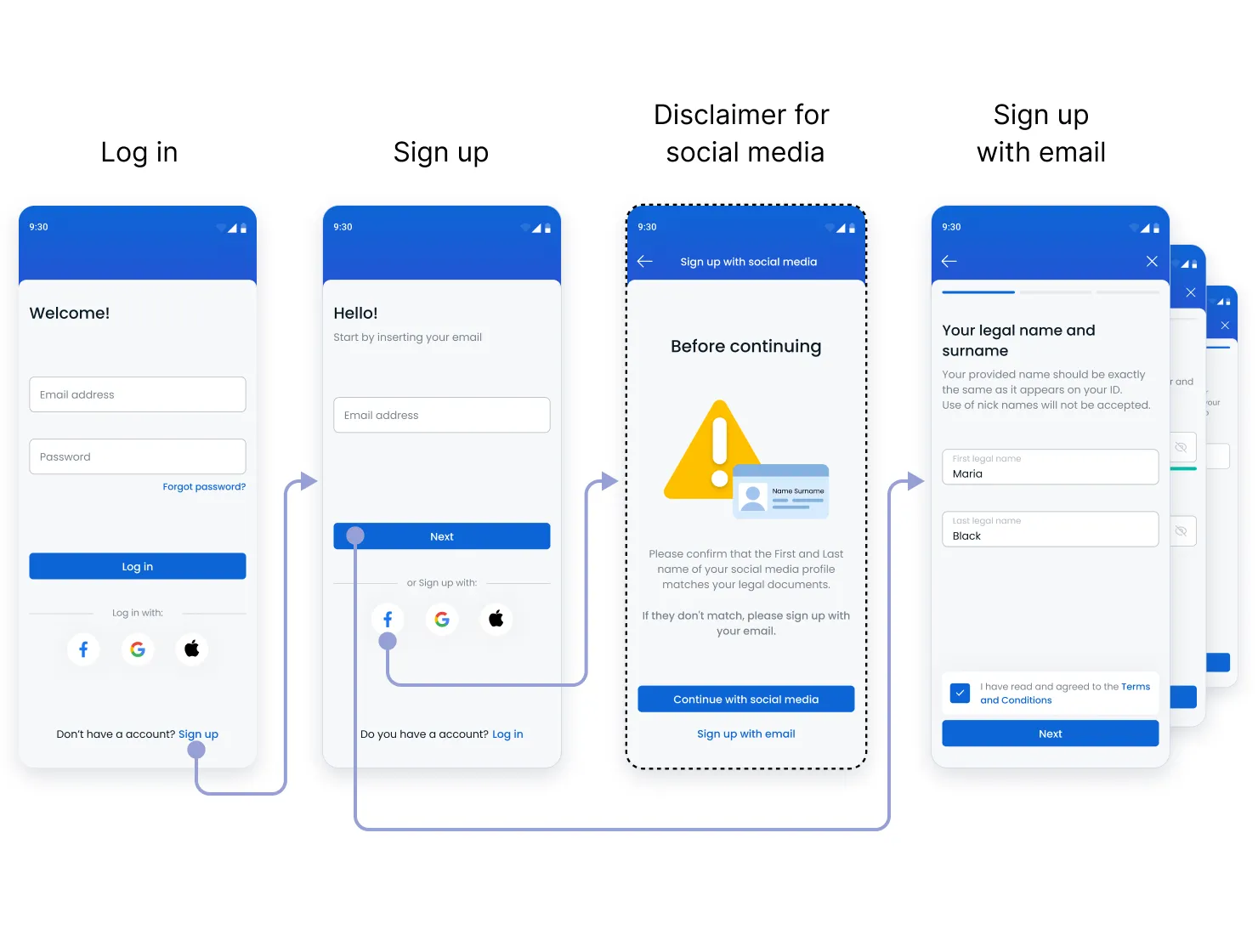
1. Sign-Up Flow
2. First Login Experience
3. Account Completion & KYC
| Business Objectives | User needs | |
|---|---|---|
| Sign up |
|
|
| Account completion |
|
|
| Service Provider Constraints | Technical Constraints | |
|---|---|---|
| Sign up |
|
|
| Account completion |
|
|
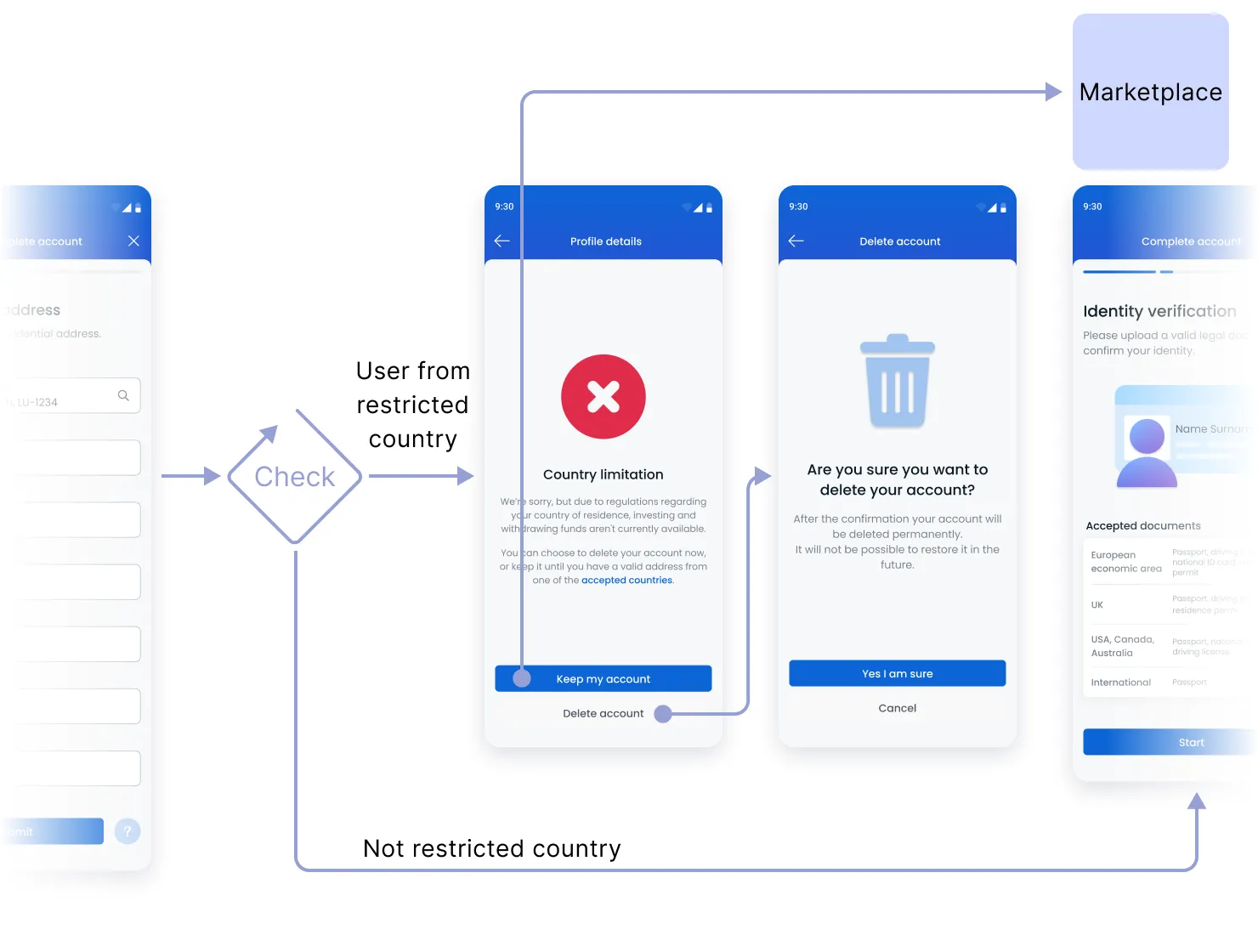
Legal Restrictions
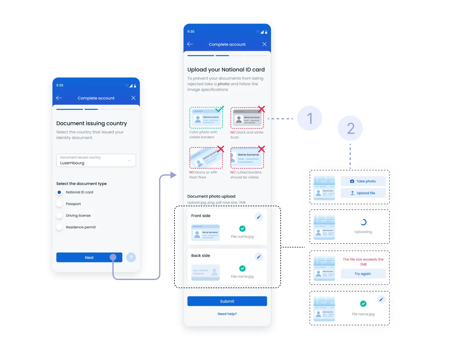
Failed ID Submission
Legal name mismatch
Drop-Off During ID Verification
Transparency on Time & Steps

Tooltips and modal warnings about social sign-up limitations.

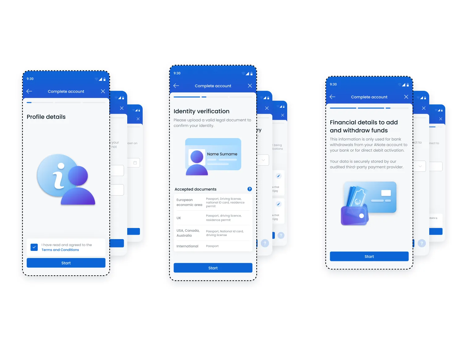
Welcome email explaining the value of music investing and an introductory screen prompting user to complete profile by explaining how much time it will take to complete it and the documents that will be needed.
Based on nationality or residency, users were notified about investment restrictions before profile completion.

Informing users the purpose of each category and the required documents that might be needed by them.
Visually, the new design needed to reflect ANote’s position as a fintech-forward, credible, and approachable brand.
Design Aims:
The result was a polished, professional interface that balances clarity, credibility, and emotional engagement - helping users feel informed and secure when entering a novel investment category.
The redesign delivered measurable improvements across multiple areas within two months of launch:
This project demonstrated how UX, legal, operational, and technical constraints can be harmonized through cross-functional collaboration and user-centered design. By tackling the root causes of abandonment and frustration, not just surface-level UI issues, we delivered a streamlined, compliant, and scalable onboarding experience.
