
ANote Music is a music investment platform that enables users to purchase shares in music catalogues and earn monthly royalties from the songs’ performance within the music catalogues. In 2023, the company observed low investment rates and tasked the product team with redesigning two key areas – the Dashboard and the Marketplace – where users explore, and select the music catalogues.
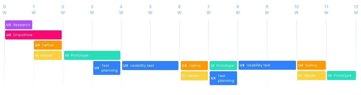
Over 12 weeks, I led a comprehensive end-to-end UX design thinking process, uncovering friction points and improving clarity across the journey to help users understand the product and make confident investment decisions. Early research revealed that user struggles extended beyond just the Marketplace and Dashboard – touching the Website, Product Pages and, Email communications. As a result, the project evolved into a broader initiative to unify and strengthen the entire experience.
Main people involved: Robert Hester (Project Manager), Virginia La Torre (Product Manager), Marzio F. Schena (CEO).
Disclaimer: All catalogues names, and numbers, included in mockups, presented in this case study, are fictional and used solely for demonstration purposes. They do not represent the real music catalogues and financial data.
After two rounds of design iterations and testing, we launched the updated platform with a more intuitive and simplified layout, clearer hierarchy, and better-aligned messaging. Key outcomes 2 months post-launch:
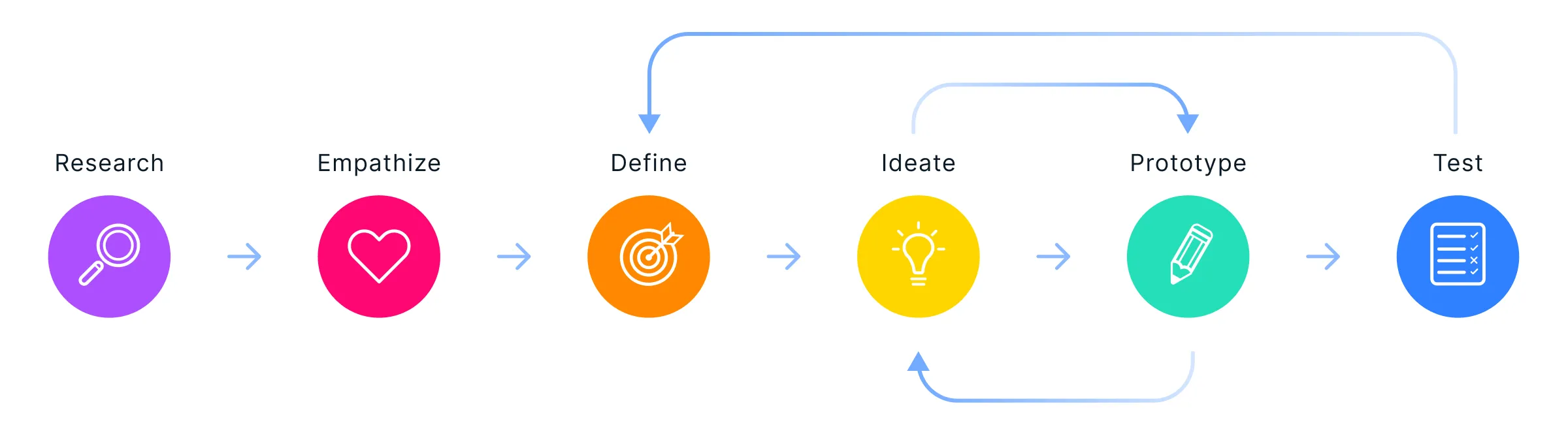
Since no formal UX research had been previously conducted, I followed a user-centered design process following the Design Thinking methodology:
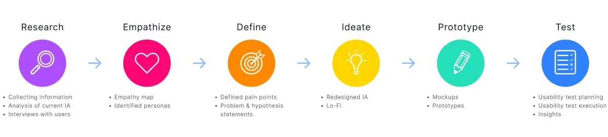
I independently led the UX Research and Design for this project, working closely with Product and Business stakeholders. My contributions included:
I started by analyzing the platform’s existing structure to understand both company objectives and user experience gaps.
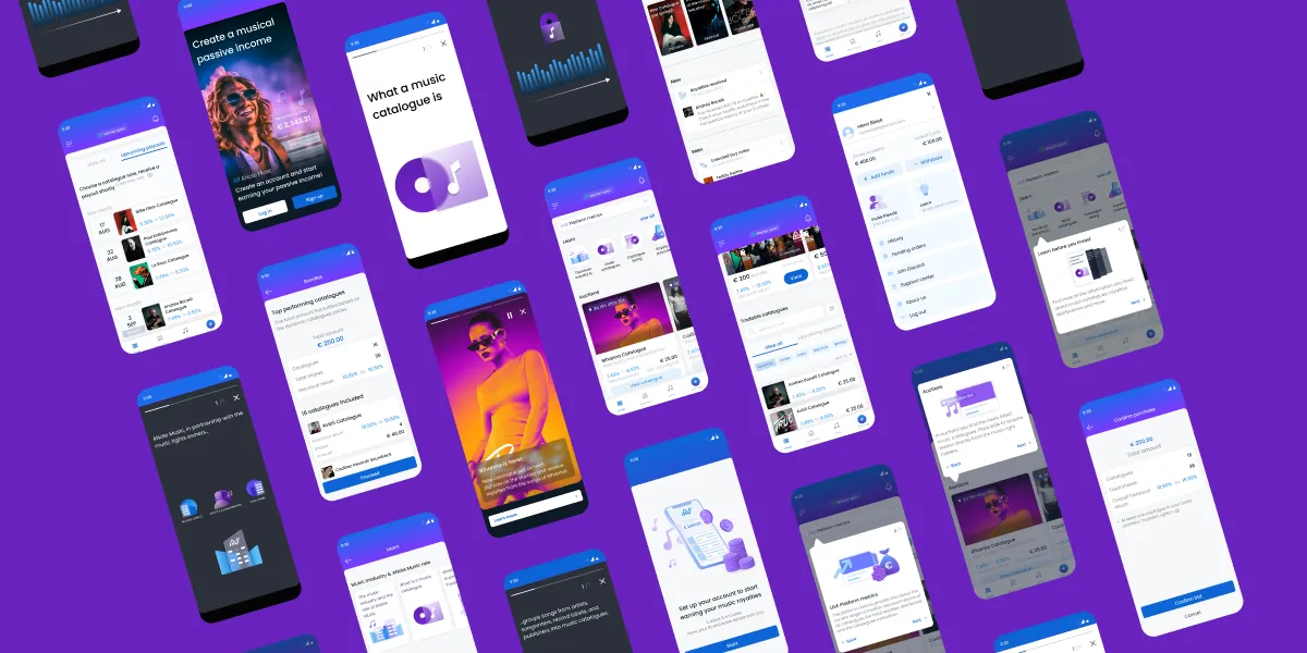
The initial app observations:

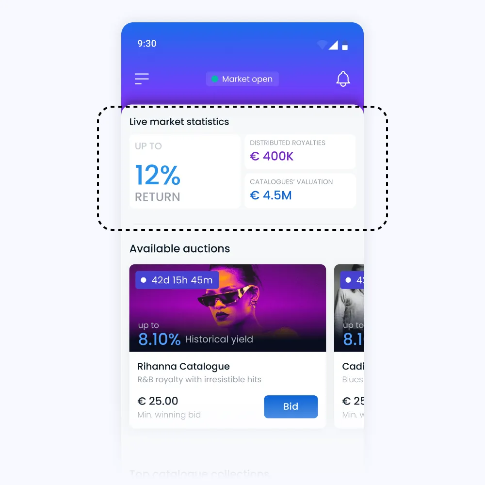
Users could browse music catalogues via the dashboard and marketplace.
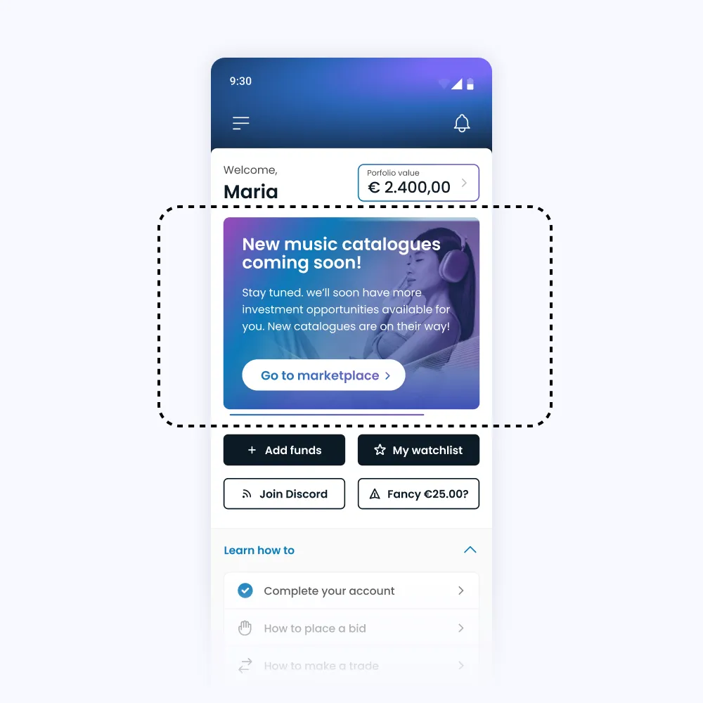
The marketing team used rotating dashboard banners (2–3 at a time) to promote upcoming catalogues and campaigns. Often remained unchanged for 1–2 months.
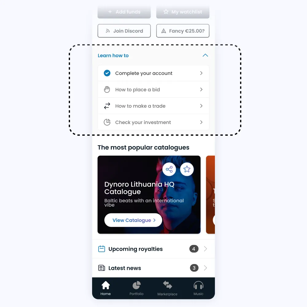
The "Learn How To" section either directed users to another platform page or redirected them to the website, where they could find guiding articles on how to add funds and place buy order.
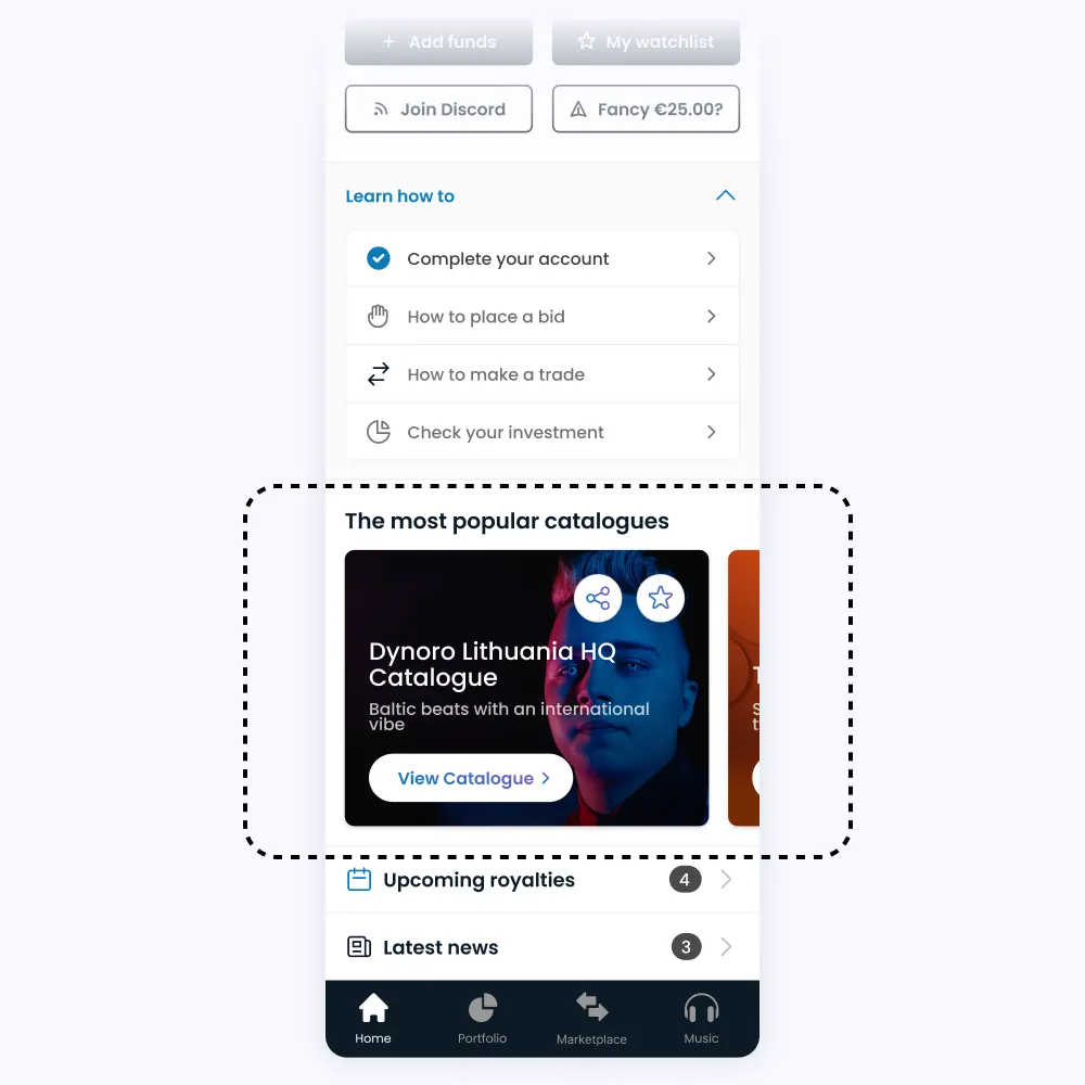
A dashboard carousel showed top-traded catalogues. Users tended to select the first few, resulting in low liquidity for others.
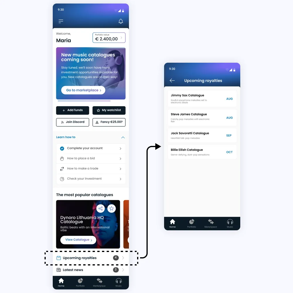
An "Upcoming Payouts" section showed which catalogues would pay royalties soon. Trading was increasing around payout dates, as users bought in to collect royalties, then sold shortly after.
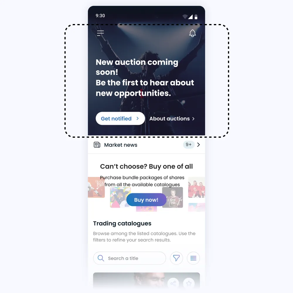
A static banner in the marketplace promoting an upcoming auction. It was replaced by the new auction catalogue once listed.
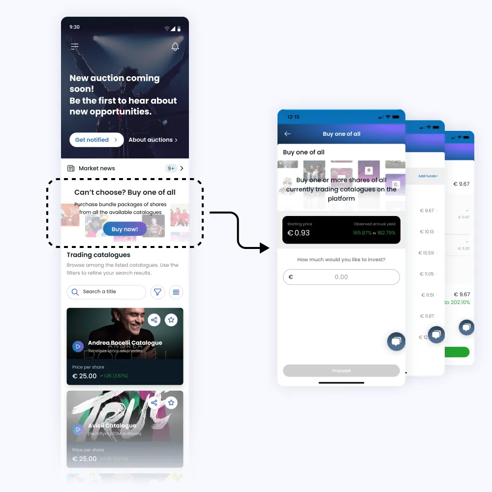
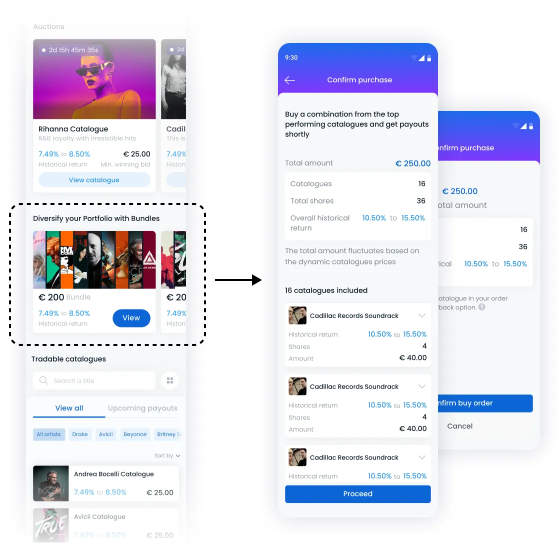
A “Buy One of All” feature allowed users to purchase equal shares of all catalogues at once, but saw little usage.
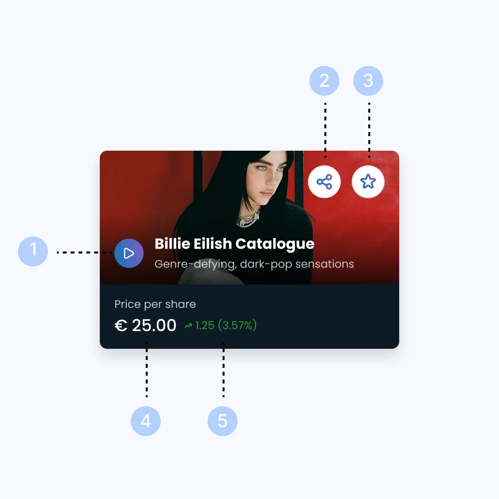
Each catalogue card included:
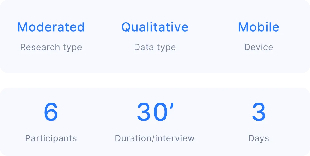
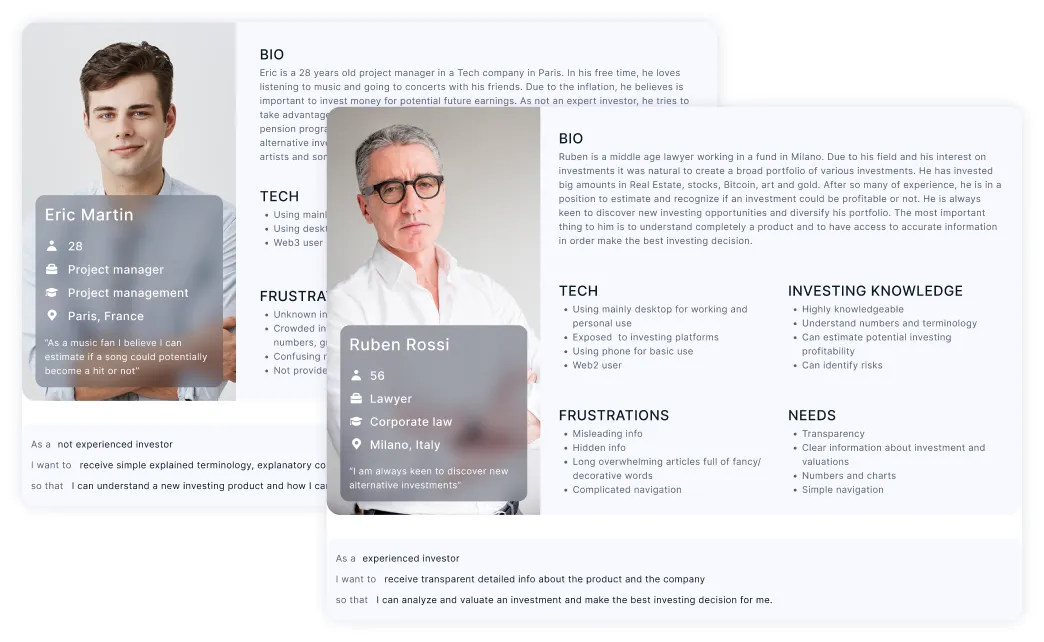
I conducted interviews with 6 users (who had funded their accounts but had not invested). The key research questions focused on user motivations, understanding, and journey pain points.
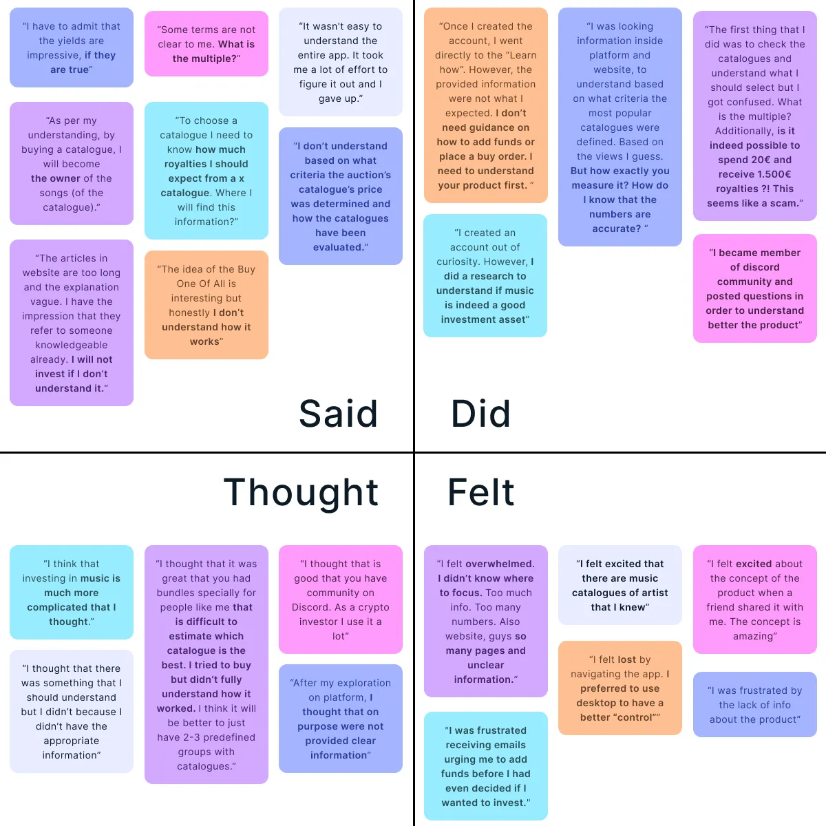
Highlights from what users said, did, thought and felt
From research insights, I created two primary personas to represent different user types and inform design decisions.
At this stage, it became clear user hesitation on investing caused by his overall experience - touching the Website, Marketplace, Product Pages, and Email communications. As a result, the project evolved into a broader initiative to unify and strengthen the entire experience. Thus, the project was divided into 4 prioritized tracks:
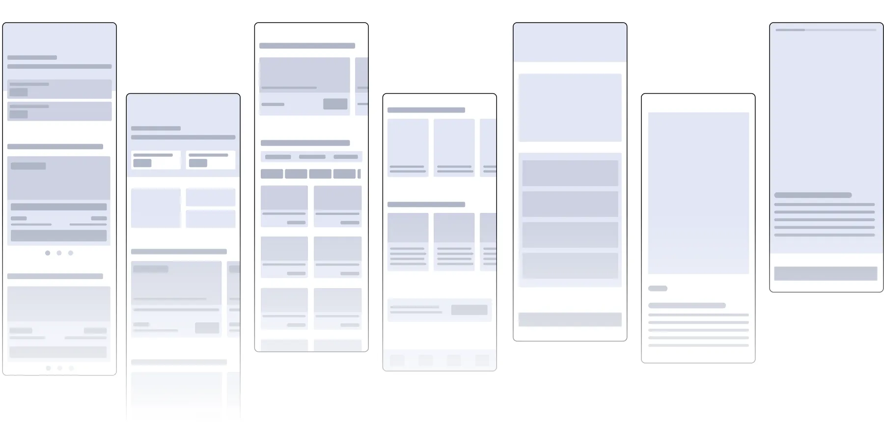
.webp)
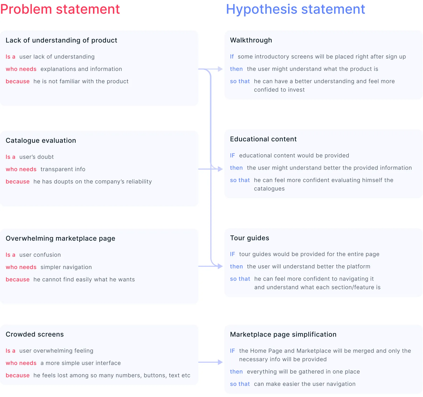

The prototypes focused on a clearer, more actionable investment experience. Key UX ideas generated included:
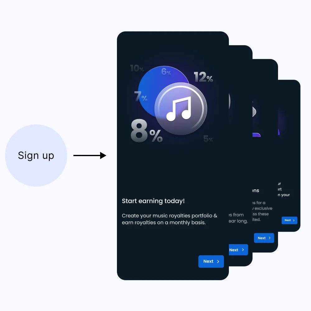
Adding a post-signup educational walkthrough (4 screens) to guide new users.
The Dashboard and Marketplace were merged into a single, clearer page. The idea was to include the live companies' numbers to make users understand that the company is trustworthy. 3 proposals were tested directly with users during the usability test
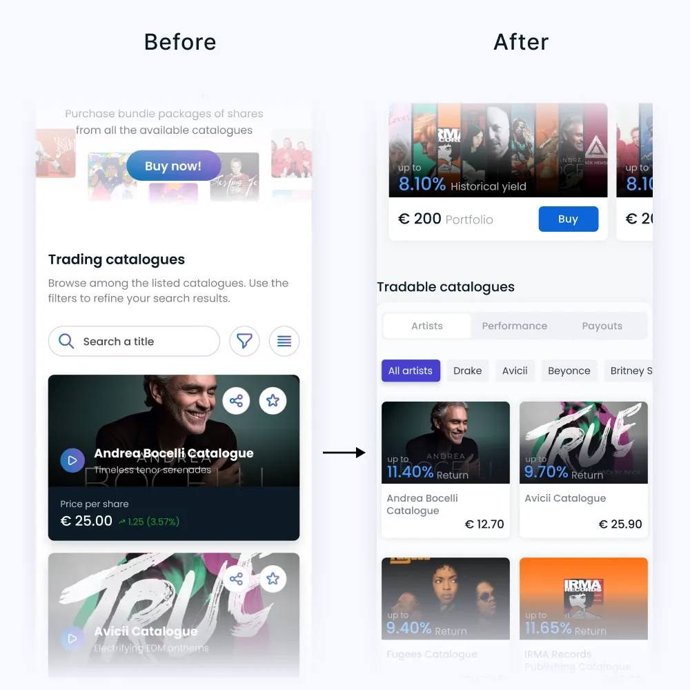
3 Tabs: User could preview the catalogues as per the 3 filtering tabs
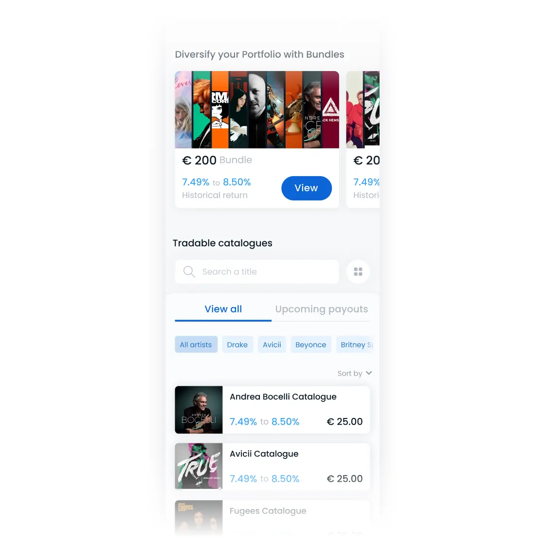
Catalogue cards simplification: Reducing displayed information to essentials only.
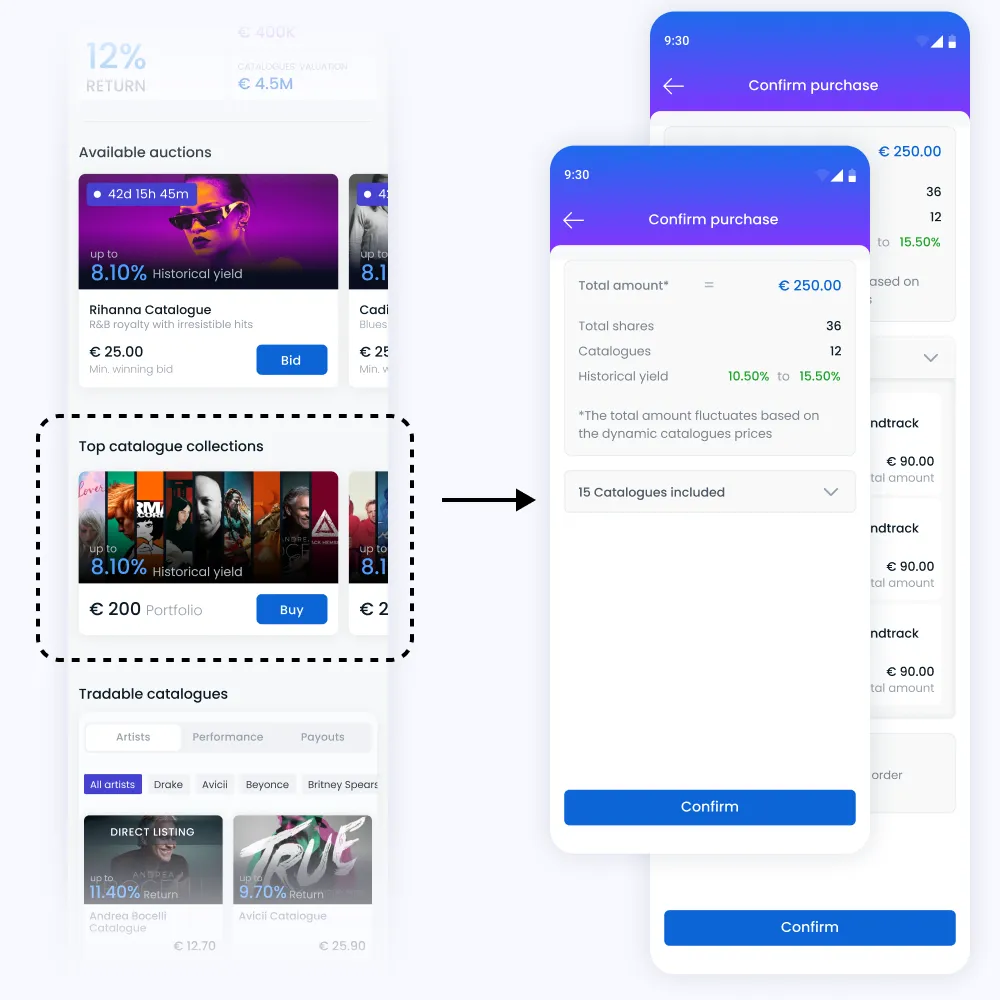
Introducing catalogue investment bundles based on predefined share groups and minimum returns to promote portfolio diversification.
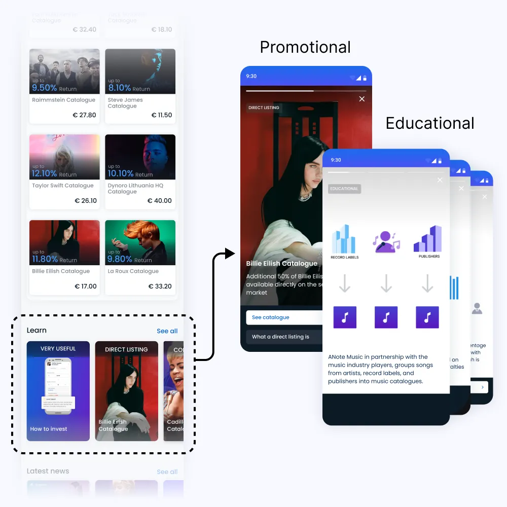
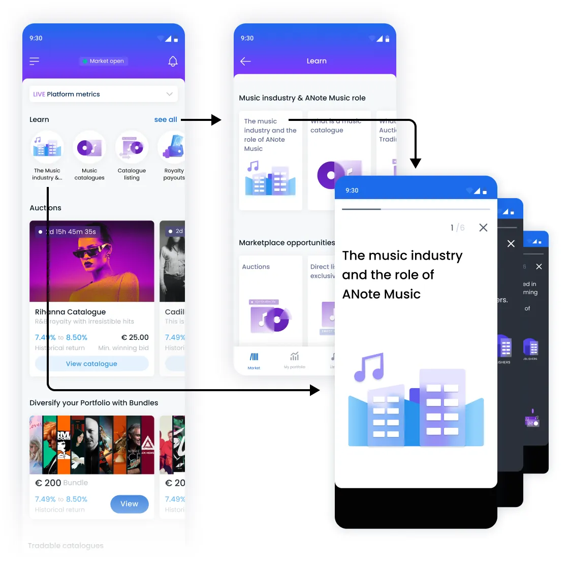
Introducing a "Learn" section within the Marketplace to assist decision-making.
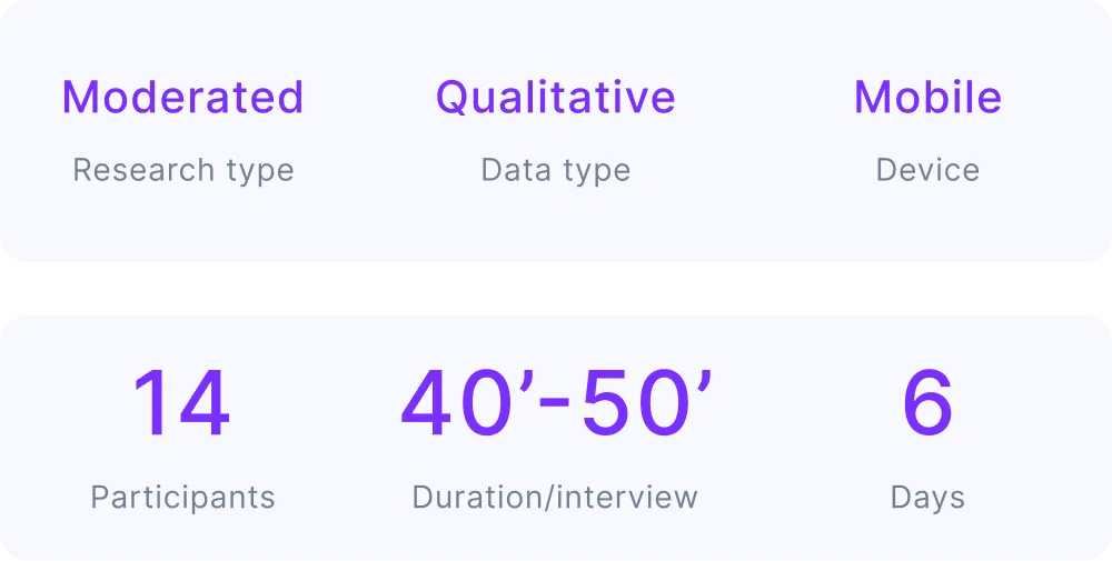
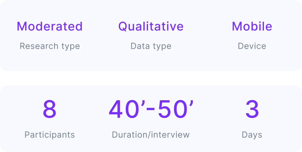
Two rounds of usability testing were conducted.
First test with 14 users:
.webp)
A second test with 8 new users was conducted:
Replaced 4 walkthrough slides with a single, action-driven page emphasizing account completion (required to be able to invest).
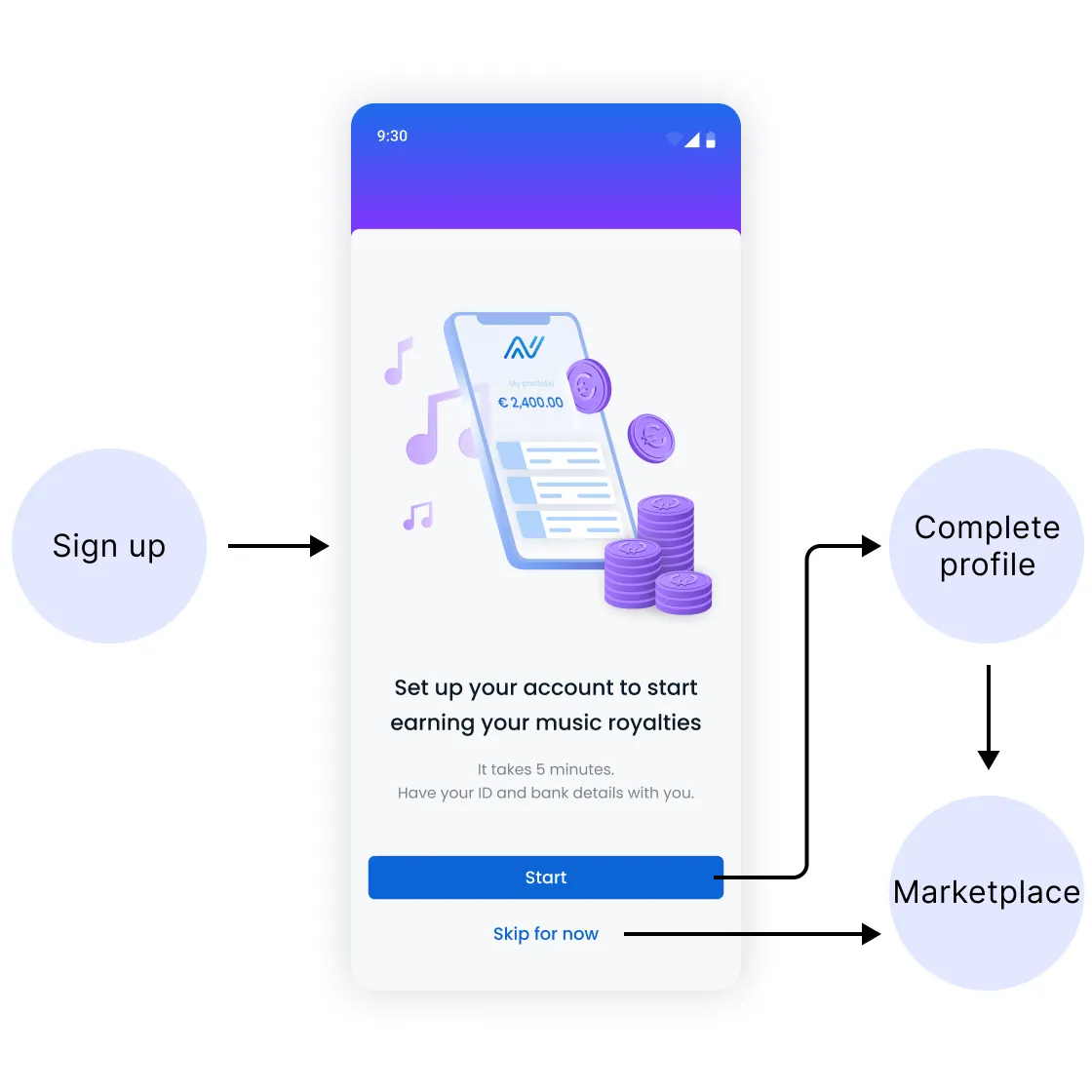
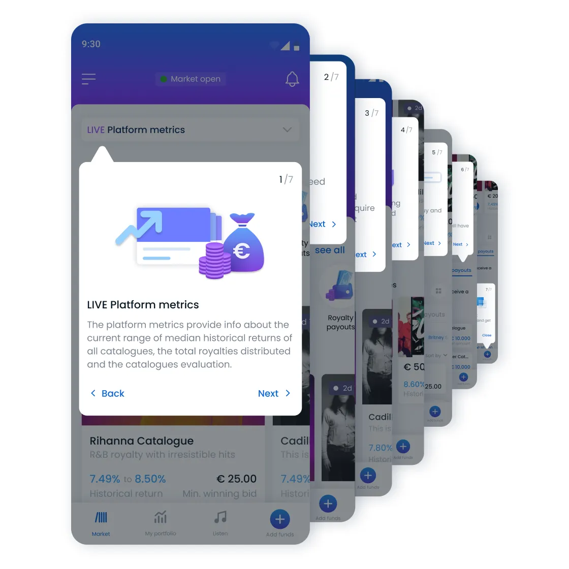
Was triggered once users were loading for the very first time the Marketplace, providing explanation for each section separately.
Educational highlights now appear first on the layout
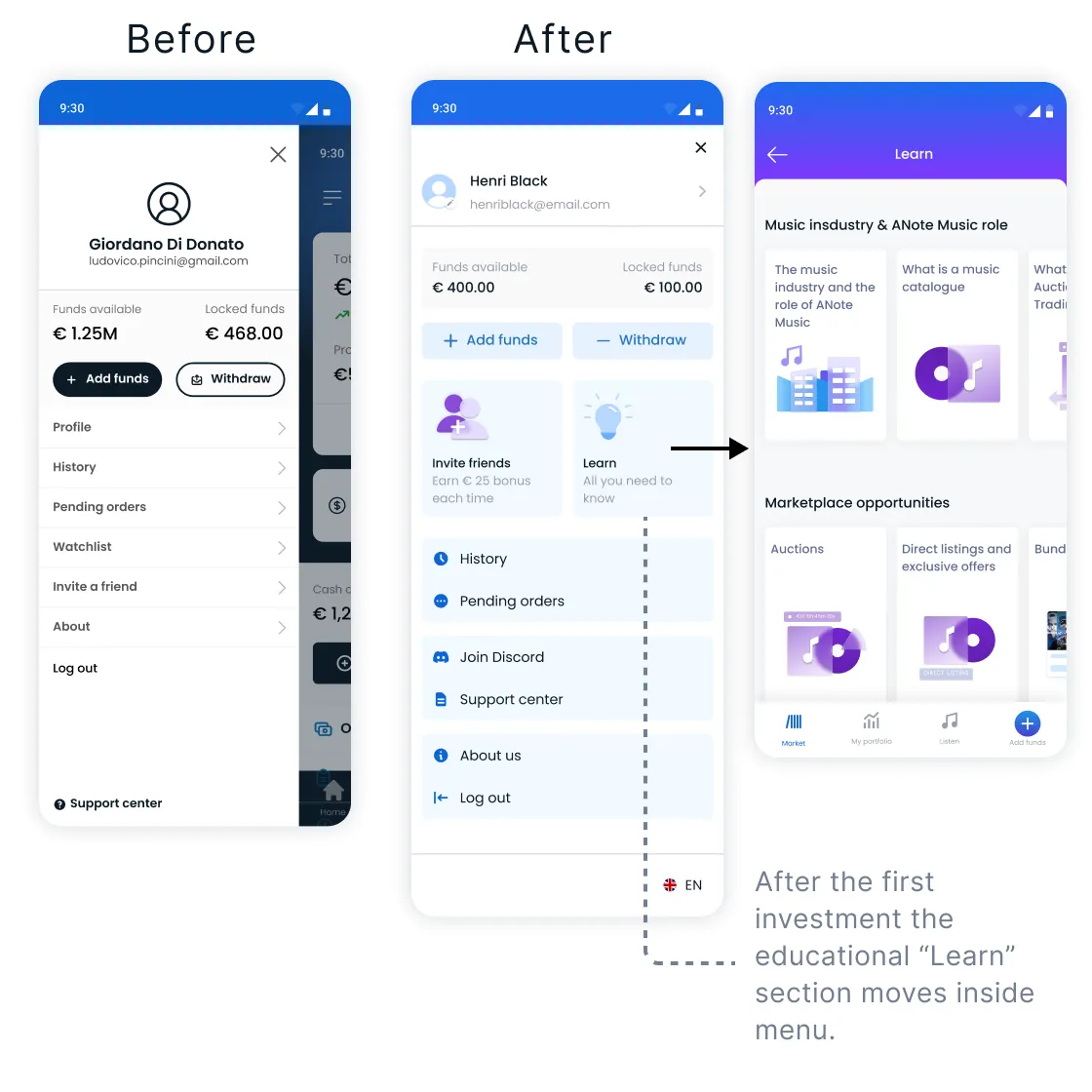
Improved scannability and information architecture. The Educational highlights (Learn) were also accessible from the menu drawer (not only from Marketplace).
Reducing displayed information to essentials only, enhancing scanability.
Simplified CTA from "Buy" to "View" to reduce user hesitation. The click rate increased significantly by changing the text button to “View”.
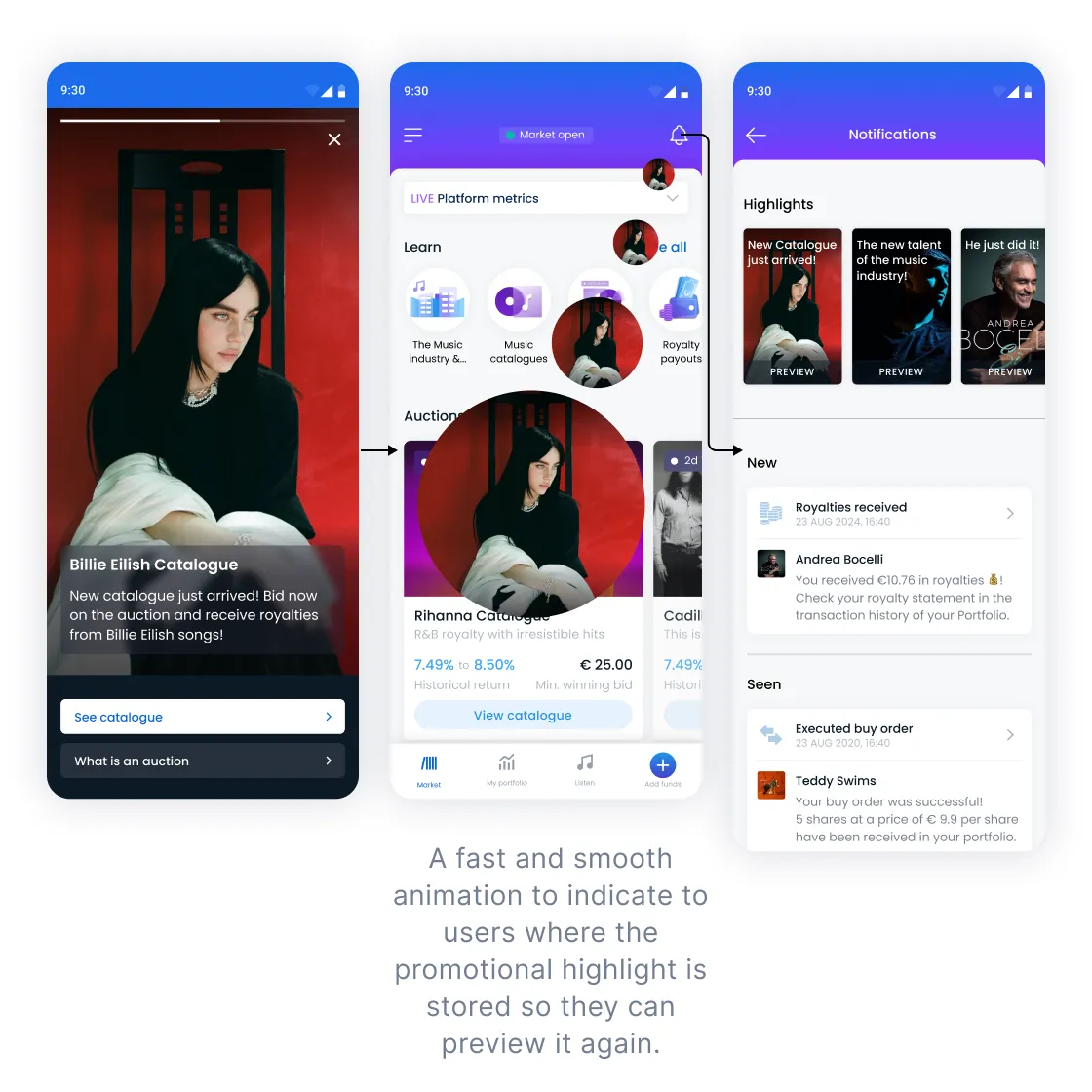
Was triggered after the second Log in. Introduced an animated, non-intrusive notification system categorized into Highlights (for all users) and Personal Notifications (based on user behavior).
Two months post-launch:
Usability tests showed that user expectations are shaped by the entire journey – not just the platform, but also Website and Email touchpoints. Upcoming priorities:
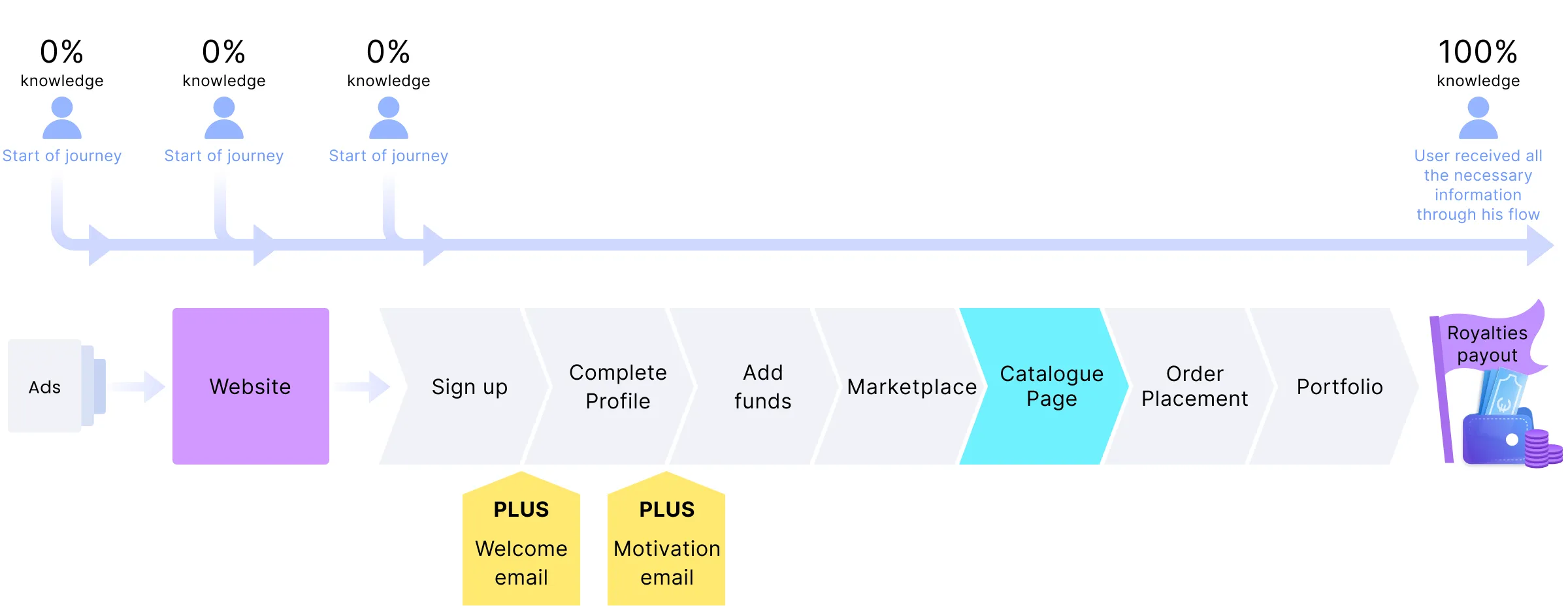
A successful investment experience isn’t just about the Marketplace screen - it’s about clear, consistent communication across every touchpoint that builds trust, understanding, and action.
