
ANote Music is a Luxembourg-based fintech company operating in the field of music royalties investment. It bridges two traditionally opposing domain, finance and music, by enabling people to invest in music as an alternative asset class.
As a relatively unfamiliar investment category, user engagement depends heavily on perception, trust, and cognitive comfort. For emerging companies especially, branding plays a critical role, as human perception filters information long before rational evaluation begins and first impressions directly influence attention and willingness to engage.
Through visual and verbal communication, a brand signals credibility, intent, and value. This case study explores how I approached branding not as a visual layer, but as a perception-driven system, deliberately designed using principles from visual neuroscience, psychology, and business strategy.
The goal of the branding system was to:
The challenge was to harmonize finance and music without overwhelming users by increasing the cognitive load or undermining decision-making.
To define the brand across five core pillars (purpose, positioning, personality, perception, and promotion), I divided the process into two complementary systems:
.webp)
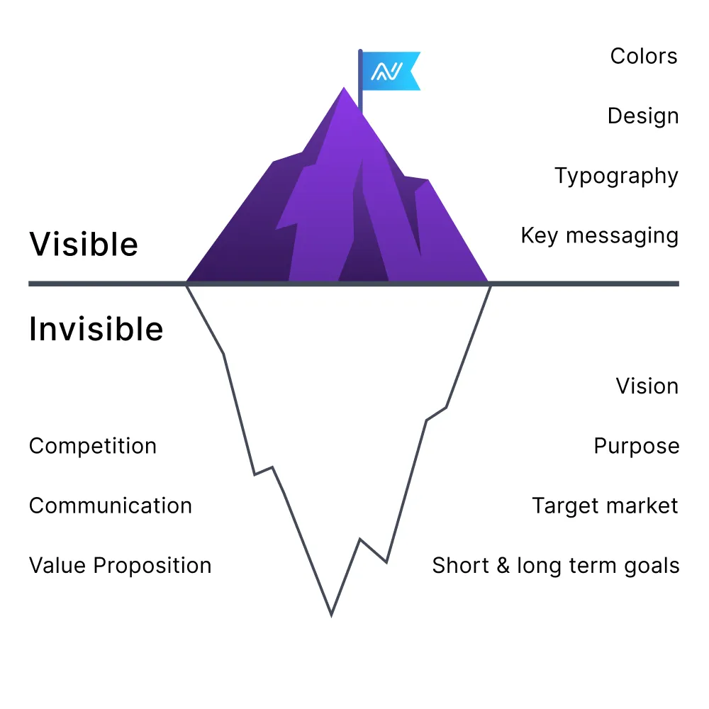
Branding is the visual expression of a company’s character, values, and promise and the reason customers choose one solution over another. It becomes the foundation for marketing, product development, and communication strategy.
Therefore, before defining colors, typography, or layouts, it was essential to understand the company at a foundational level:
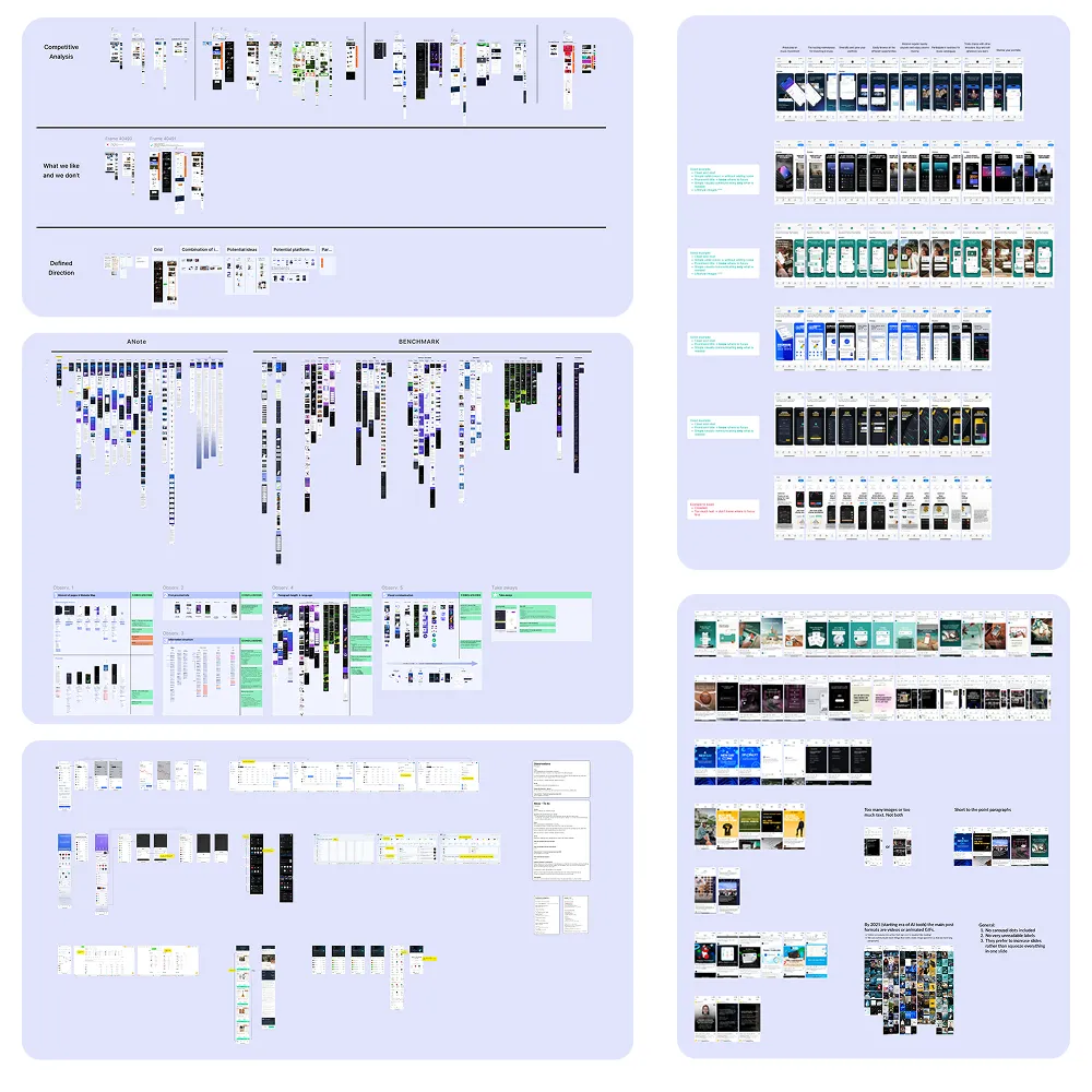
A comprehensive market analysis was conducted across direct and indirect competitors. The research included:
This analysis helped identify patterns, best practices, and gaps, enabling clear positioning for ANote Music. Key questions addressed:
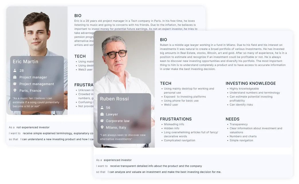
Defining the exact target group is essential for meaningful communication. Personas were created not just to capture demographics, but to reflect:
This shared understanding helped align internal teams and ensured that the brand language was adapted to real human needs.

From the target group analysis, several key insights emerged:
Emotional drivers
Cognitive needs
Primary cognitive tensions
Understanding these tensions was critical to defining how the brand should feel and behave.
ANote Music occupies a unique space between fintech platforms and music industry players, competing indirectly with traditional investment products and alternative assets.
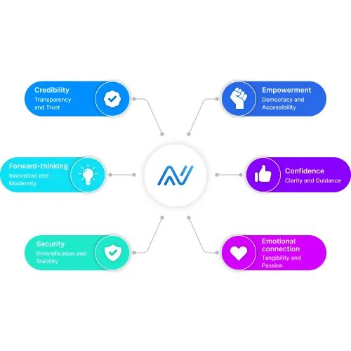
The brand needed to be:
This resulted in five perceptual brand pillars:
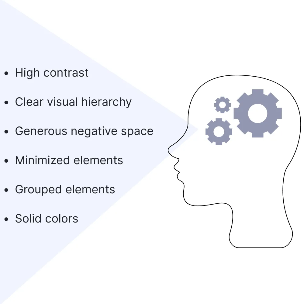
Approaching branding through neuroscience helped define how visual choices affect cognition and trust.
Key principles included:
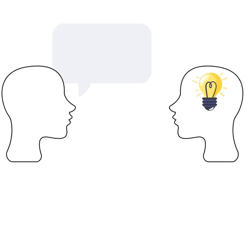
Tone of voice defines personality and shapes perception across all touchpoints. For a fintech music investment platform, the tone needed to balance credibility and emotion.
Defined tone attributes:
Should be avoided:
Design principles were derived directly from perceptual and business insights:
Each principle aligns a perceptual insight with a concrete business goal.
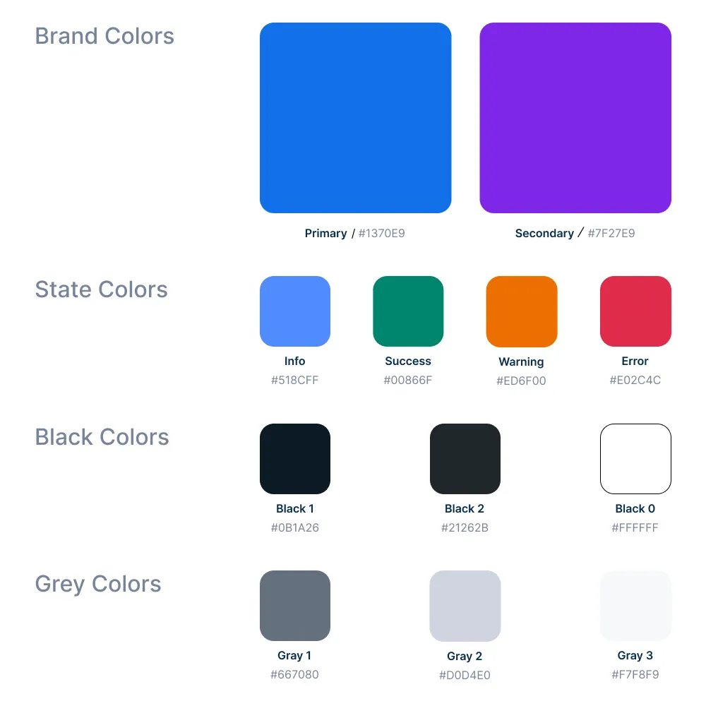
Colors were defined for functional and cognitive purposes:
This system supports hierarchy, recognition, and reduced cognitive effort.
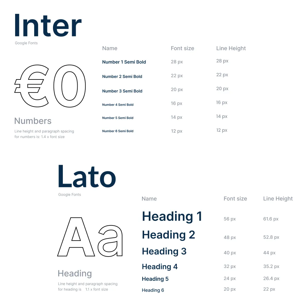
Typography plays a critical role in readability, usability and decision-making. Lato and Inter were selected due to:
These characteristics reduce fatigue and support informed investment decisions. Each font style was selected to serve different purposes and to used on different materials.
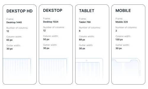
Spacing and layout were intentionally designed to:
Visual rhythm supports a calm, predictable experience, essential in financial contexts.
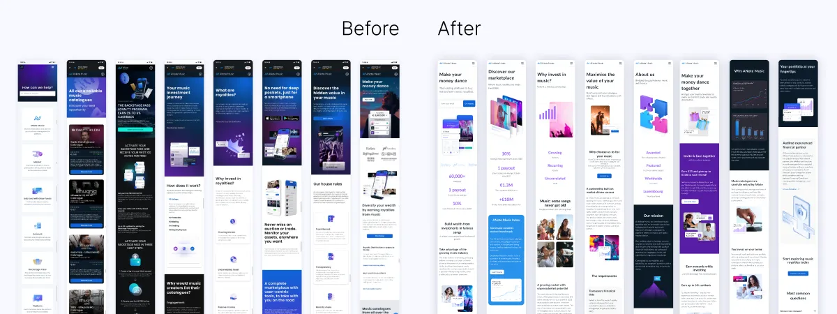
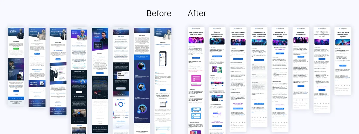
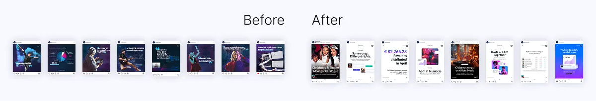
To ensure consistent implementation of the new brand system, I led the creation of structured templates and detailed design specifications to guide designers, product managers, and engineers.
These guidelines translated the branding principles into practical, scalable assets across all touch points, including the platform UI, marketing website, email communications, social media content, and investor PDF reports.
Beyond visual consistency, the system ensured alignment with the defined perceptual principles (clarity, hierarchy, cognitive ease) and enabled cross-functional teams to apply the brand confidently and efficiently.
This approach transformed branding from a visual direction into an operational framework that supported long-term product and business coherence.
Branding is not decoration or the mere selection of colors and typography, it is perception engineering. Effective branding integrates visual neuroscience, psychology, and business strategy to shape how information is processed. Visual systems influence attention, trust, and decision-making, especially in financial contexts. In complex products, UX/UI and branding are inseparable; together, they determine how information is understood, interpreted, and ultimately acted upon.
