
ANote Music is a music investment platform that enables users to purchase shares in music catalogues and earn monthly royalties from the songs’ performance within these catalogues. Usability testing conducted in 2024 revealed significant users' understanding issues around the music investing concept and the ANote Music product - starting from the website.
The findings showed that many users struggled to fully understand the product and how the platform worked, leading to low account creation and investing rates during non-promotional periods and an increase in customer support tickets. As the lead designer, I executed a complete end-to-end redesign of the platform’s public-facing website, from research and strategy to UI design and Webflow implementation. I focused on improving clarity, reducing cognitive friction, and ultimately enhancing user trust and engagement.
During the project I collaborated with: Irene Ciuci (Digital Marketing Strategist), Geoffrey Hamerlinck (Community Manager & Graphic Designer), Virginia La Torre (Product Manager), Ginna Lozano (Customer Success Officer), Marzio F. Schena (CEO).
Key user problems:
Key business problems:
User Goals:
Business Goals:
Key outcomes 2 months post-launch:
The initial website (dating back over six years) was no longer aligned with user expectations or business goals. I began with a deep analysis of the current experience to identify friction points and content gaps. It became evident that aligning internal stakeholders around a shared vision was critical. I facilitated workshops and collaborative discussions with all team members to define the website’s new direction and ensure alignment across the team.
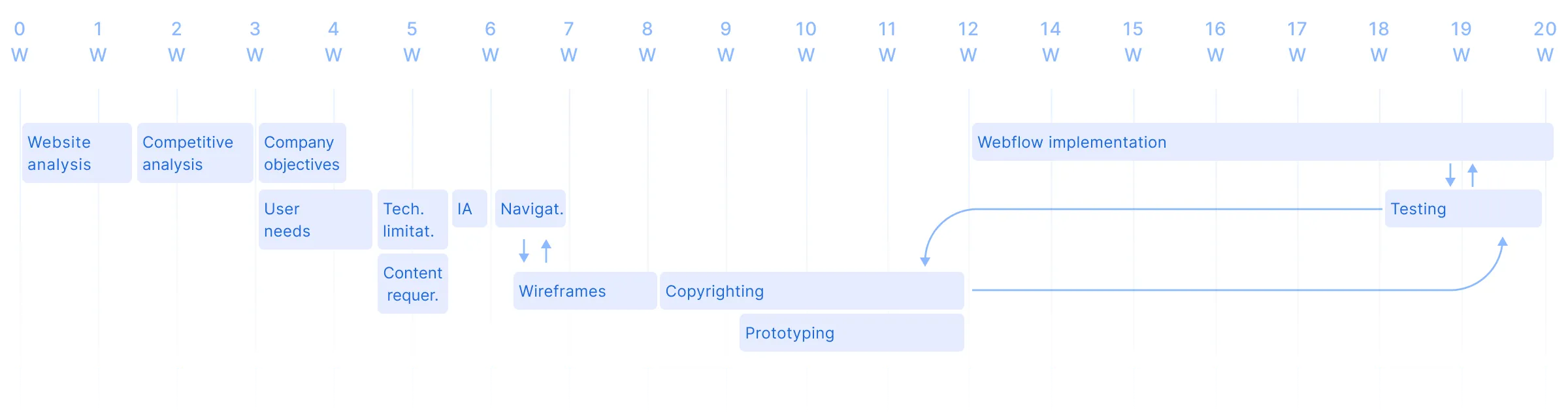
It was a group design project where Marketing team, Product manager and the CEO of the company were included. From my side, I led independently, covering every stage of the UX and UI lifecycle:

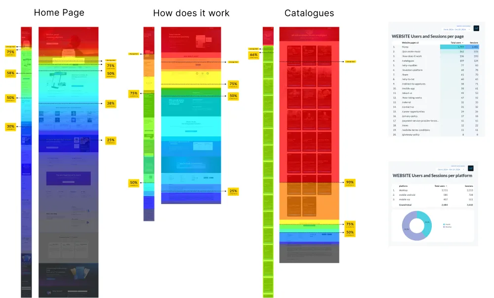
Findings based on previous tests and analyses:
Findings based on previous tests and analysis:
Given these limitations, Webflow was selected for its flexibility, CMS capabilities, and alignment with our design system.
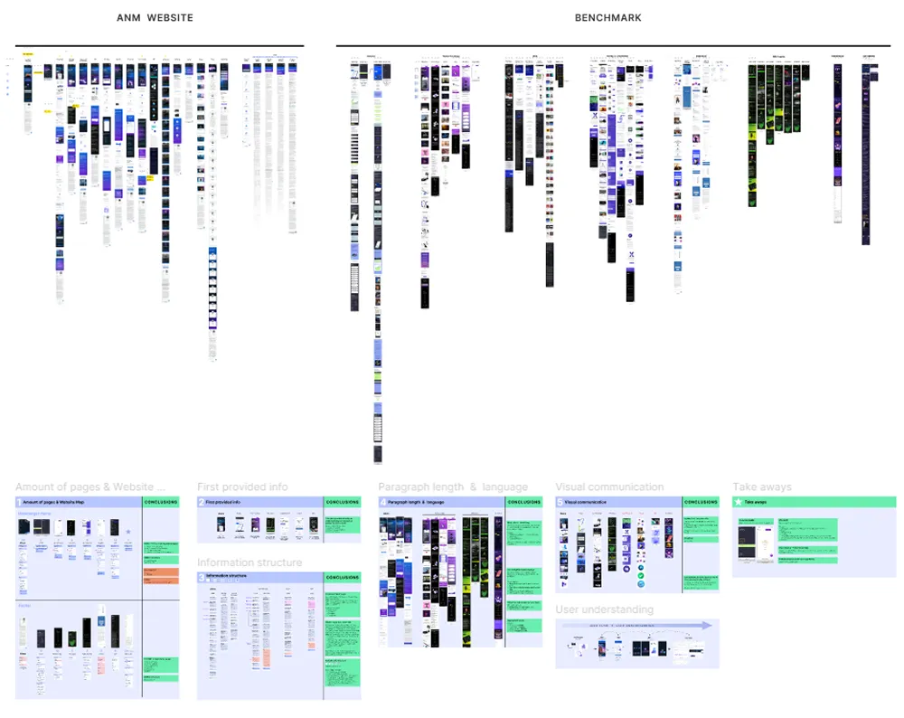
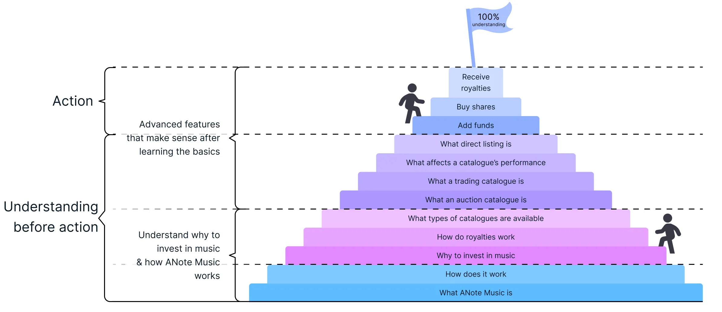
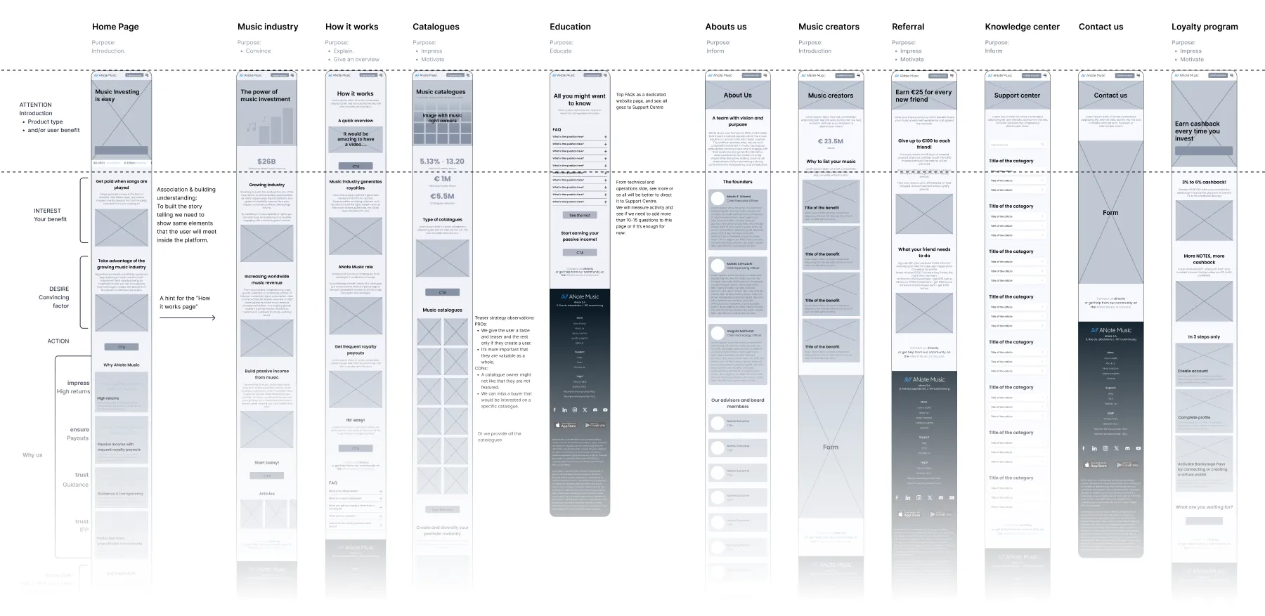
In a previous usability test I analyzed what information users receives during their journey - Website & Platform. Based on this analysis, I defined the main 3 pillars that should be explained to the users in a simple way so they can understand the core product.
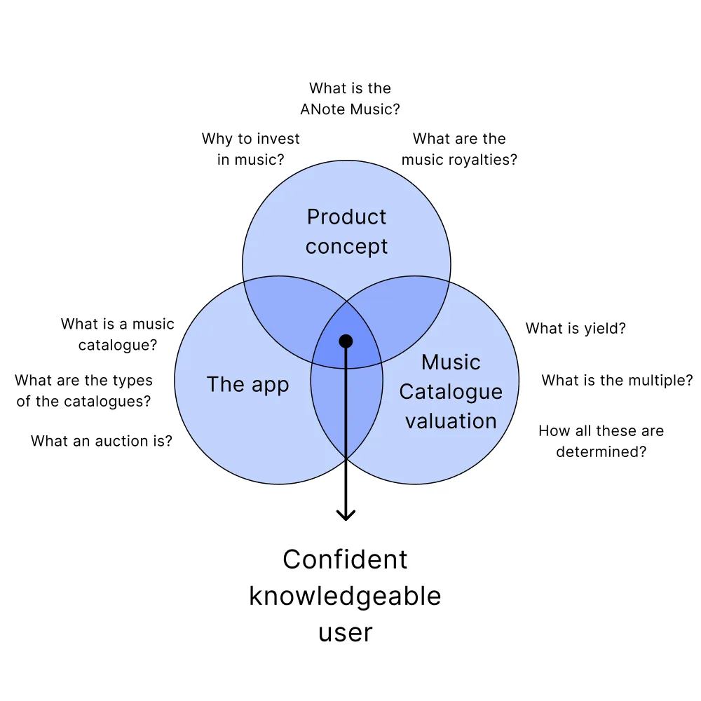
Afterwards, I defined the information that should be provided in advance that would help them to structure on top all the additional information that they would meet later on in their journey.
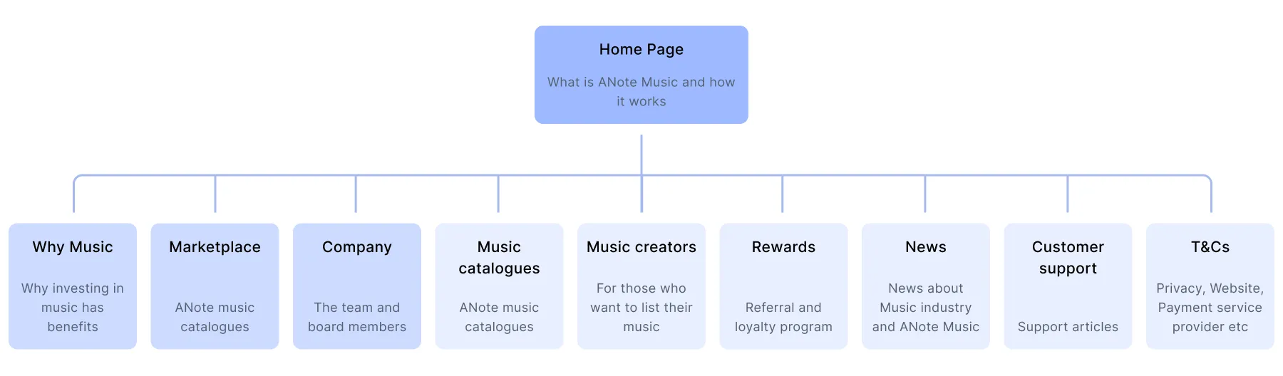
To simplify the user journey and reduce decision fatigue, the navigation was restructured to focus on 4 primary areas:
Secondary pages (e.g., Rewards, Music creators, Support center articles, Legal) were moved to the footer to declutter the main navigation while remaining accessible. This allowed us to focus the core user flow on educating and onboarding new investors.
Wireframes were developed in three iterative rounds to align user needs, marketing goals and management expectations. These early prototypes focused heavily on:
Insights from previous testing showed that users often missed CTAs or were unsure about what action to take. In response, buttons were redesigned with clearer affordances and strategic placement throughout each page.
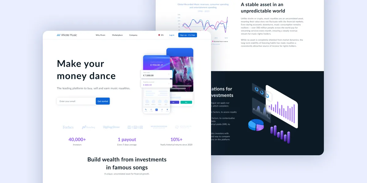
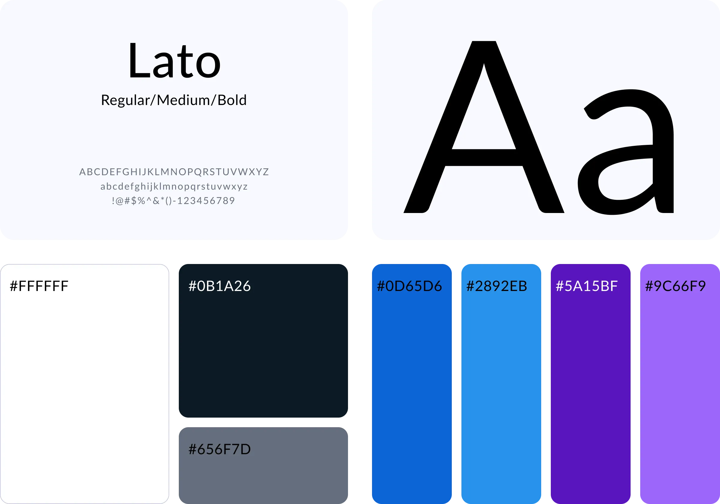
Visually, the new design needed to reflect ANote’s position as a fintech-forward, credible, and approachable brand.
Design aims:
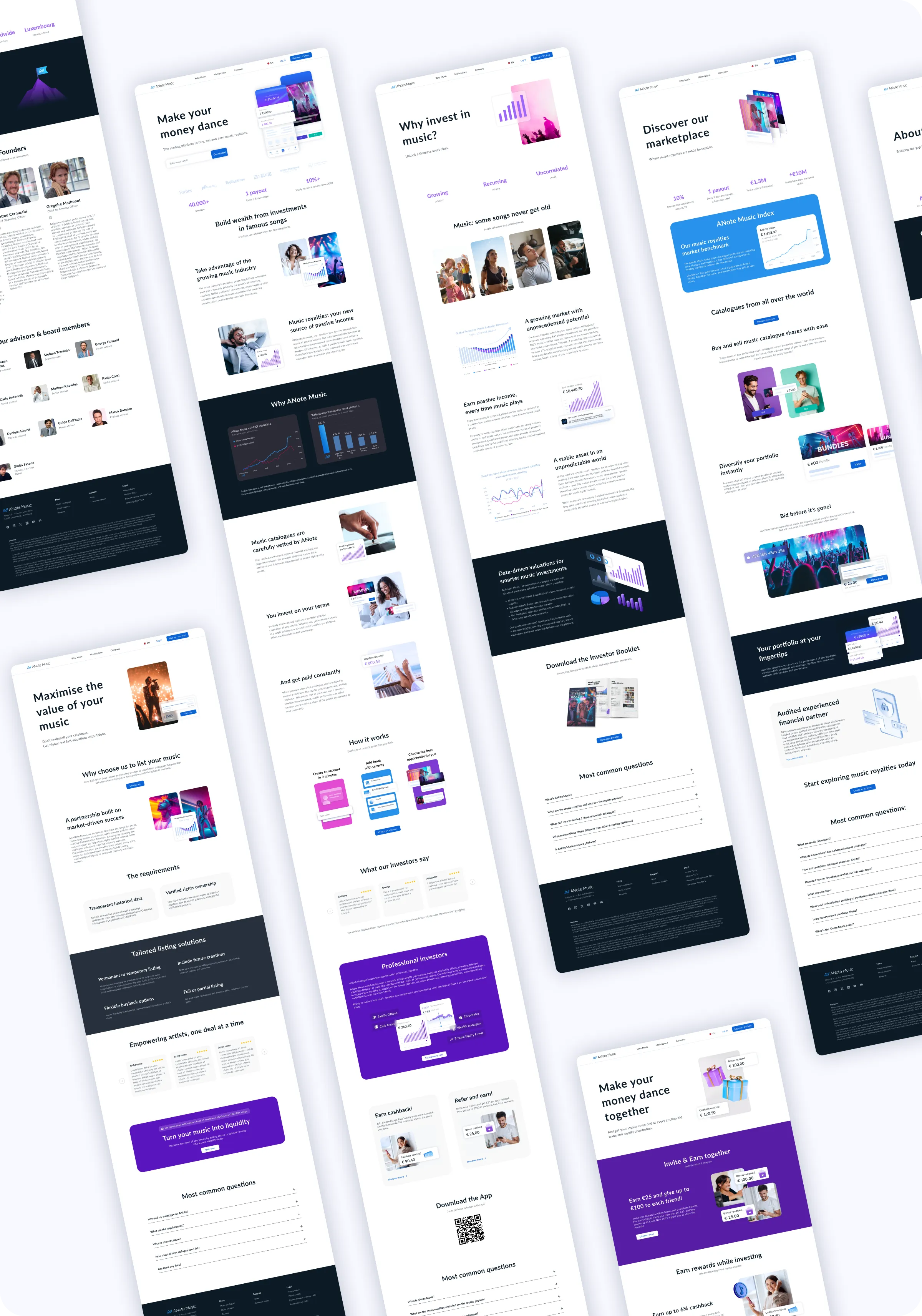
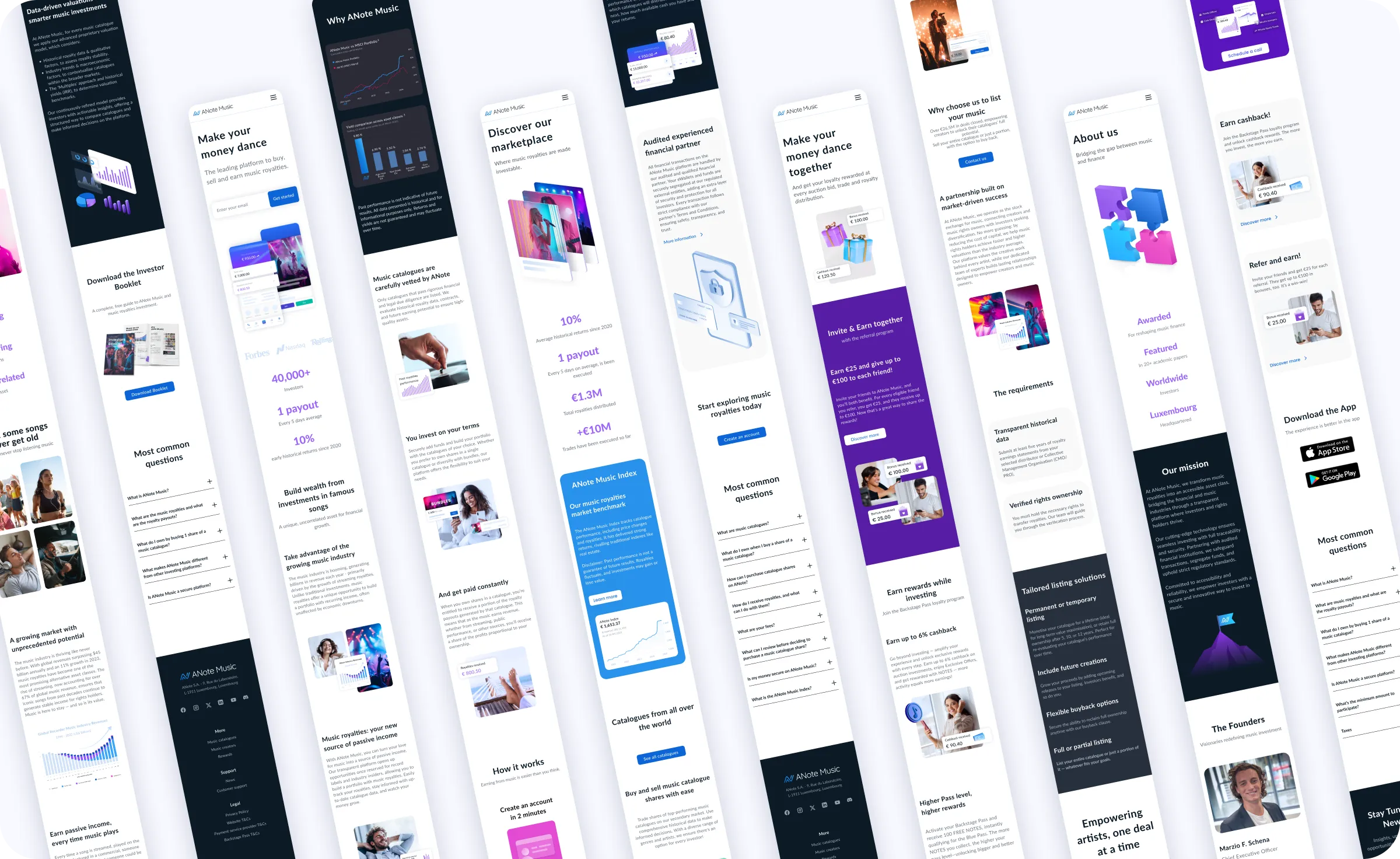
The result was a polished, professional interface that balances clarity, credibility, and emotional engagement – helping users feel informed and secure when getting involved with music investment.
This project successfully aligned ANote Music’s website with modern UX best practices while addressing user pain points uncovered during testing. Early indicators post-launch included:
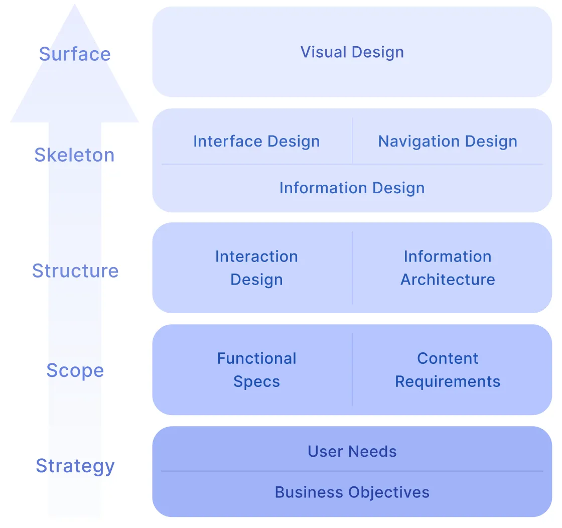
By applying the 5 Planes of UX, we ensured that every design decision was grounded in strategy, structured around real user needs, and executed with clarity and consistency.
